Finding the “Right” Color
There is tremendous power in getting the colors right. No matter how loosely executed, an impressionistic landscape painting takes on photorealistic qualities merely by having the correct colors for a scene with its particular light.
For that reason, most people wanting to make a mosaic portrait begin by trying to find the “right” color for the skin type they are trying to render, whether it be a pinkish northern European skin tone or a Latino coffee color or whatever.
When these people email us asking questions like, “which tile would you use to render the skin of a caucasian person?” or “which tile color would you use to make a mosaic of Polynesian faces?” my answer isn’t what these people are expecting or wanting:
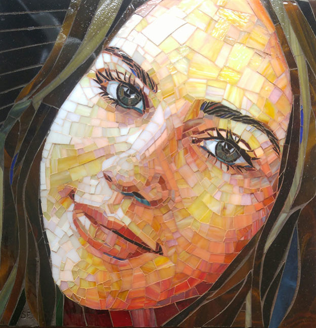
Mosaic portraits should not be thought of in terms of one particular color that generally represents the skin tone of a race or individual. Instead, look at the highlights and shadows of the model photograph and think in terms of rendering those areas in a way that gets their colors right.

The shadows and highlights usually won’t be rendered with a single color, and they often won’t include that one particular color you most associate with that race or individual’s skin tone.
That is true even if you are trying to render as photorealistically and as conservatively as possible and aren’t trying to create visual interest by including small flourishes of unexpected colors.
TIP: The take away is that when you are ordering samples for a mosaic portrait, order a range of hues and shades in addition to whatever you order to find that one idealized color because you could end up using that one particular color least of all.
Suzanne Coverett Earls
Artist Suzanne Coverett Earls has some amazing mosaics at her website, and they are worth seeing for several reasons:
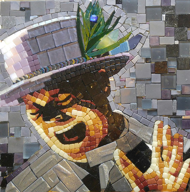
Suzanne’s mosaic portraits are both photorealistic and visually engaging, and they include some excellent examples of how to use mixed media (different types and sizes of tile) for figurative images. Her pet portraits are inventive and inspiring.
Suzanne makes great use of stained glass and harnesses the power of that special material without losing a mosaic style. In short, her website is a great place for mosaic artists to “learn by looking.”
Mixed Media

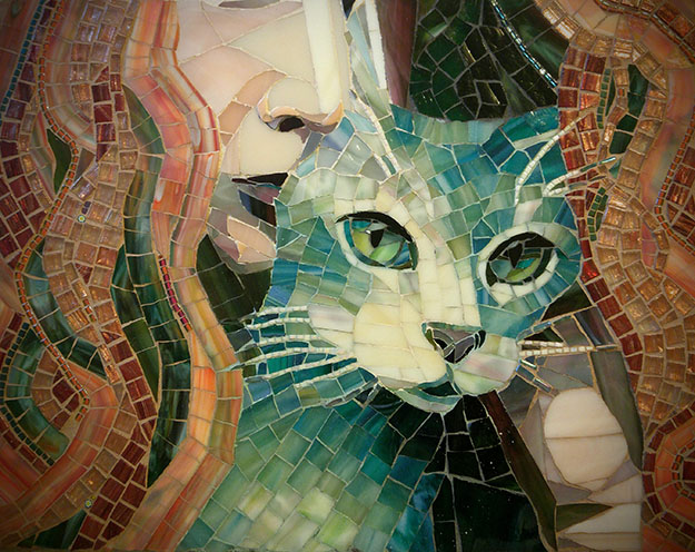
The above mosaic uses complimentary colors of the same muted intensity (amber oranges versus teal greens) for maximum color contrast. This contrast gives the ambers and teals an intensity they would not have on their own.
The Rhubarb mosaic portrait also combines stained glass and metallic glass tile for added visual interest. And then there is the composition itself, which is warm and intimate and makes you wonder why more pet portraits don’t include the people who give them love. I give this one five meows.
Innovation

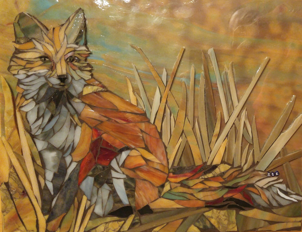
Note that the mosaic above uses a sheet of stained glass for the backer, which is left exposed for the background areas. Also notice how the blades of grass are rendered using whole shards of glass instead of artificially cutting them up for a “mosaic” look and feel. Lastly, notice how little red was used to render this red fox.


Leave a Reply