Tag: color scheme
-
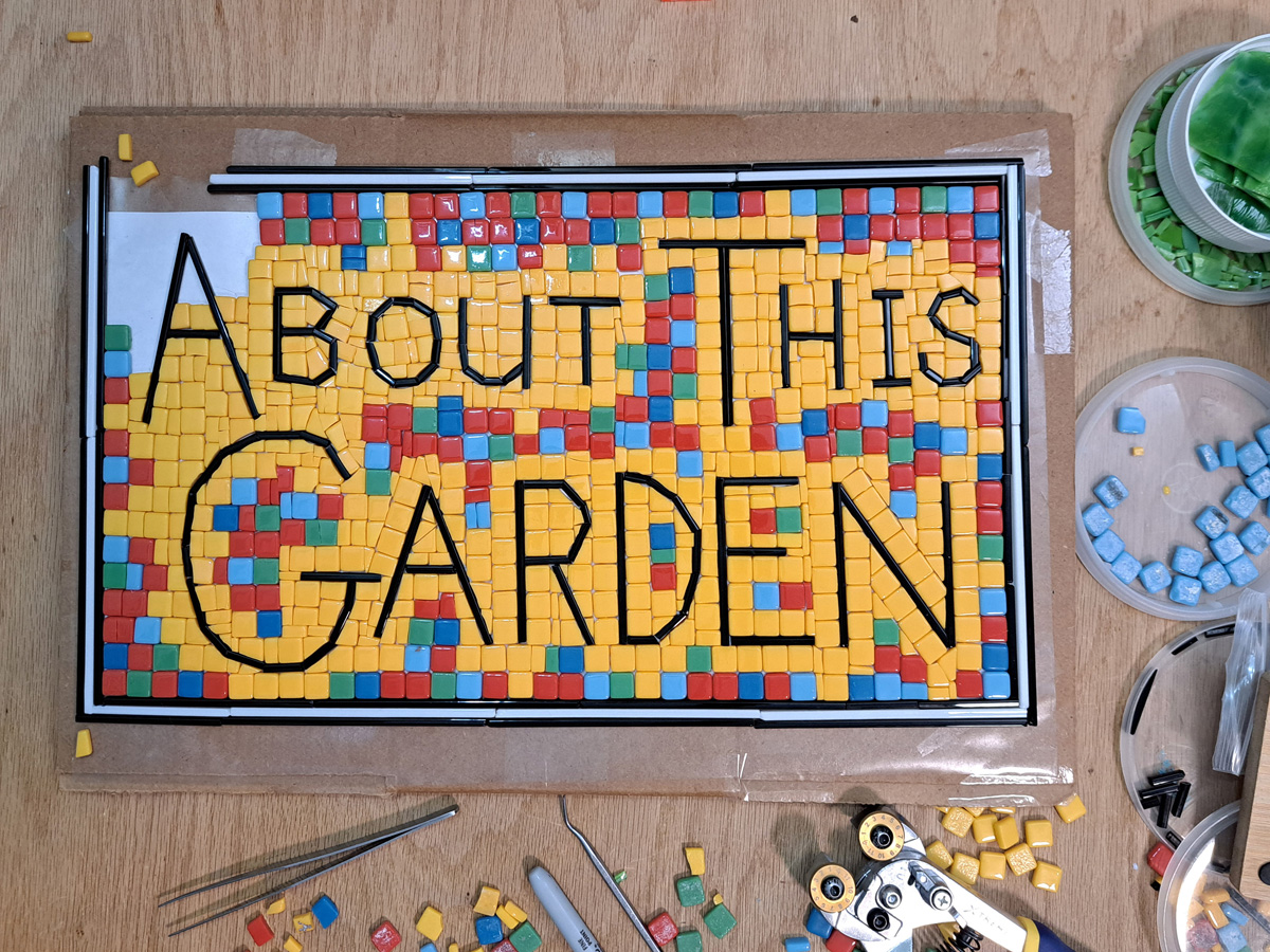
Mosaic Garden Sign
The Mosaic QR Code that I made for my garden needs some text with it because most people assume the sign is for some realtor or other commercial service. I decided to make a mosaic sign with the text “About This Garden” that could be displayed with the QR Code Mosaic.
-
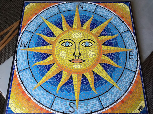
Value Contrast and Variegation in Small Mosaic Artwork
I have written quite a bit about using color variegation to increase visual interest and the importance of value contrast in mosaic artwork. These two concepts are related, at least in a crude way: they both involve using multiple colors instead of one color, and they both make the artwork more interesting visually. Value Contrast…
-
White Grout: The Floral Print Aesthetic
Artist Masha Leder‘s mixed pique-assiette architectural mosaics using white grout are so good I wanted to name this blog article “In Praise of White Grout.” I have been hoping more people would email me some photos of their white-grout mosaic artwork ever since I started posting about avoiding white grout in mosaic images, meaning figurative…
-
Color Constraints and Background Colors
Many artists like to choose background colors after the central figures have been tiled. It is best to tile from the middle and work toward the edges to avoid awkward spacing between at key focal points, but you should not leave the color choices for the background as a complete afterthought. Nor should you have…
-
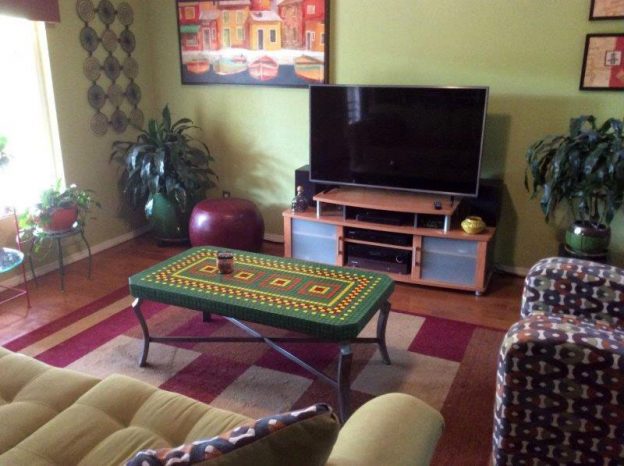
Mosaic Tables and Interior Design
Artist RJ Spurr recently completed two mosaic tables for his home, and I wanted to share them because the level of craft work is excellent, and the designs are integrated with the color schemes of rooms where they were installed. The great thing about dry indoor mosaics is that you can use wood as a…
-
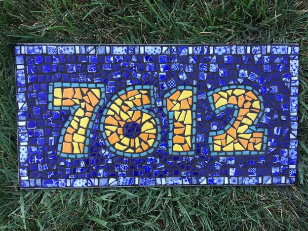
Mosaic Letters and Numerals
You can make mosaic street numbers and signs using a grid, but mosaics made from irregular shapes of non-gridded tesserae are more interesting, especially if you use concentric andamento for the background surrounding the figures. Sara Sommers emailed us some pictures of her mosaic street number plaque, and it is made from cut pieces of…
-
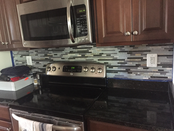
Kitchen Backsplash Mosaics Using Original Designs
If you search Google Images for “kitchen backsplash mosaics,” you can see some good work, but you will also see way too many photos of beige and gray tile work that really doesn’t help too much in the way of inspiration, especially if you are wanting to make an original figurative mosaic or use colors…
-
Staining Grout With Acrylic Paint
Mosaicists sometimes mix in artist acrylic paint to create custom colors from white grout, but you can also use acrylic paint to “stain” grout after it has hardened (for dry indoor mosaics). Like the process of staining wood, “staining” grout with paint is a process of wiping on and wiping off. The paint sticks to…
-
Increase Visual Interest by Using Variegated Colors
You can increase visual interest in your mosaic by using variegated colors (multiple colors in patches or streaks) instead of monochromatic fields of only one color. This technique is particularly effective if your design is relatively simple and made from outlined areas of color like a coloring book or cartoon.
-
Matching Grout to a Room’s Color Scheme?
Choosing a grout color is more of a situation where you want to avoid making a mistake that causes the tile to look wrong than it is an opportunity to tie in the room’s color scheme by selecting some optimal color. A Case Study Should you match grout color to a room’s color scheme? Not necessarily. Making…
-
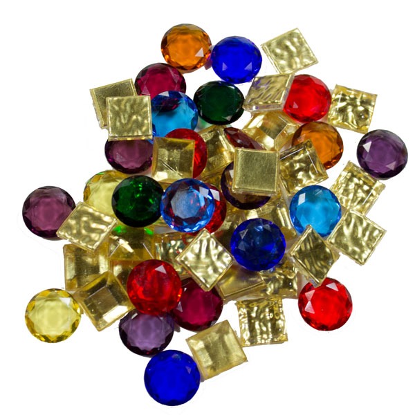
Mosaic Jewels, Gold, and Silver
The following picture of 24kt Gold Leaf Mosaic Glass Tiles mixed with Faceted Glass Jewels is the best evidence I can point to for our renewed commitment to finding exciting new products for use in mosaic artwork: Mosaic Gold 24 kt with Faceted Glass Jewels could be used to make wonderful mosaic art in a medieval…
-
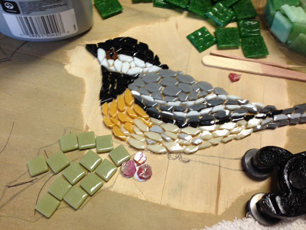
Choosing Mosaic Colors Based On Contrast
Recently artist Jill Miller emailed me wanting some advice about choosing colors for a mosaic table top she was making, and the design she was a chickadee bird with holly leaves and berries. From her photos and a description of the colors she wanted to use for the border of the round table top, it was…