For those of readers who were asking for inspiring examples of no-grout mosaics, I give you the mosaics of Canadian artist Terry Nicholls.
I am amazed by Terry’s work and its continuity. It is a very focused exploration of the mosaic medium as a fine art.
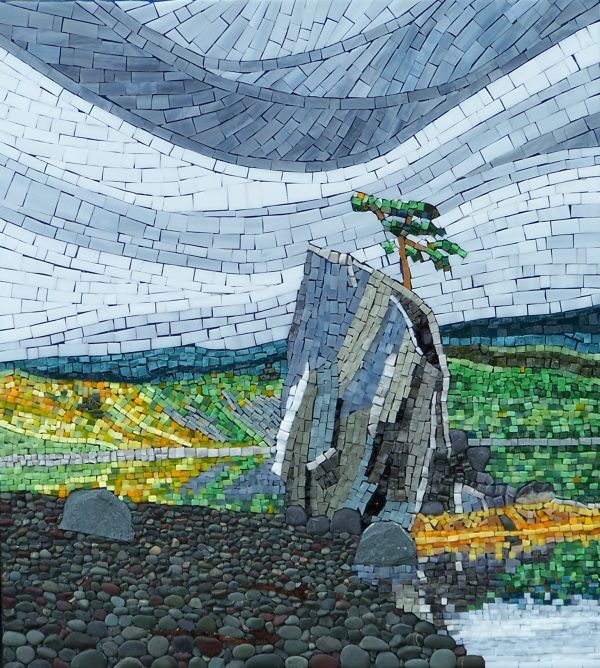
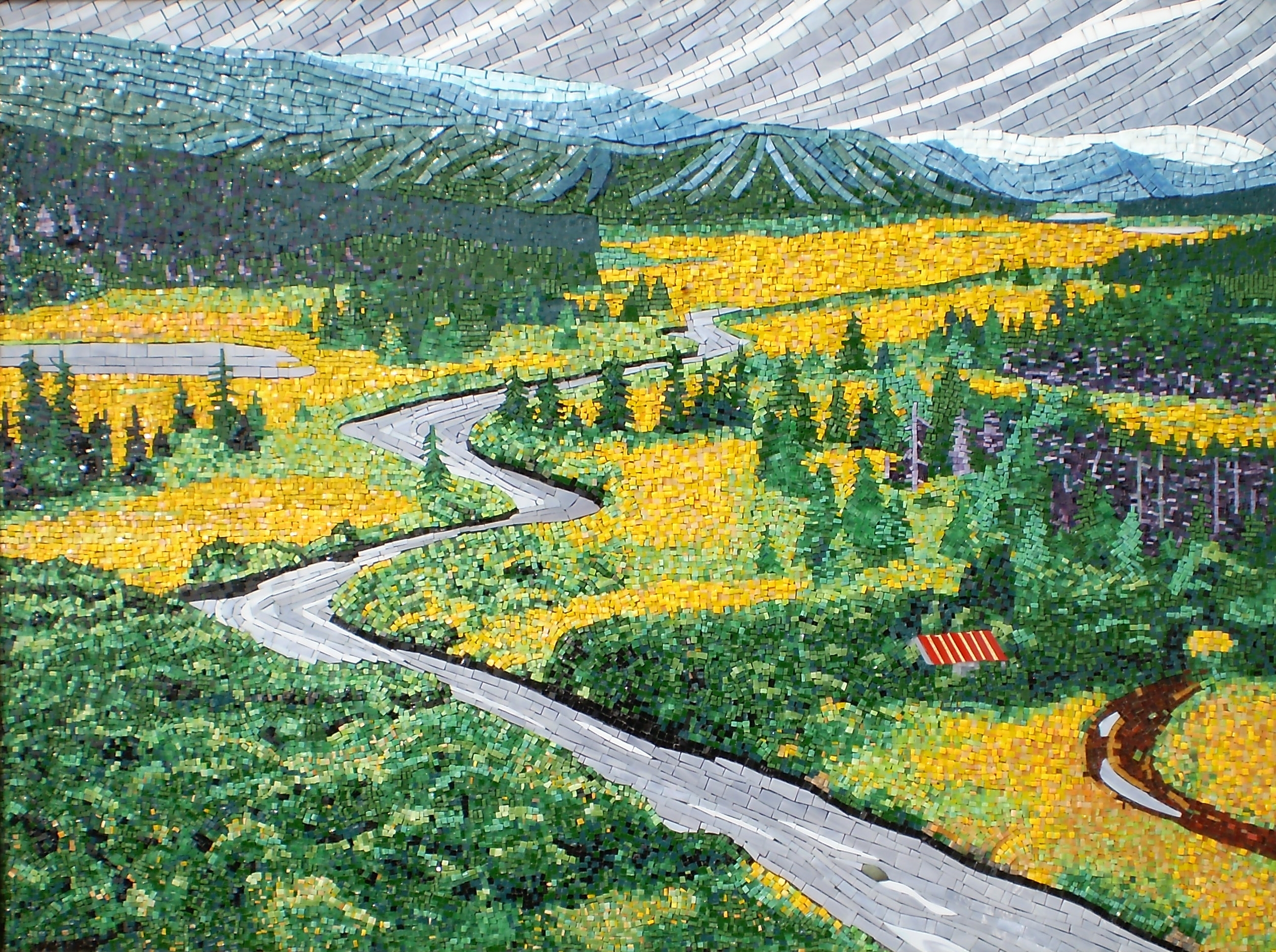
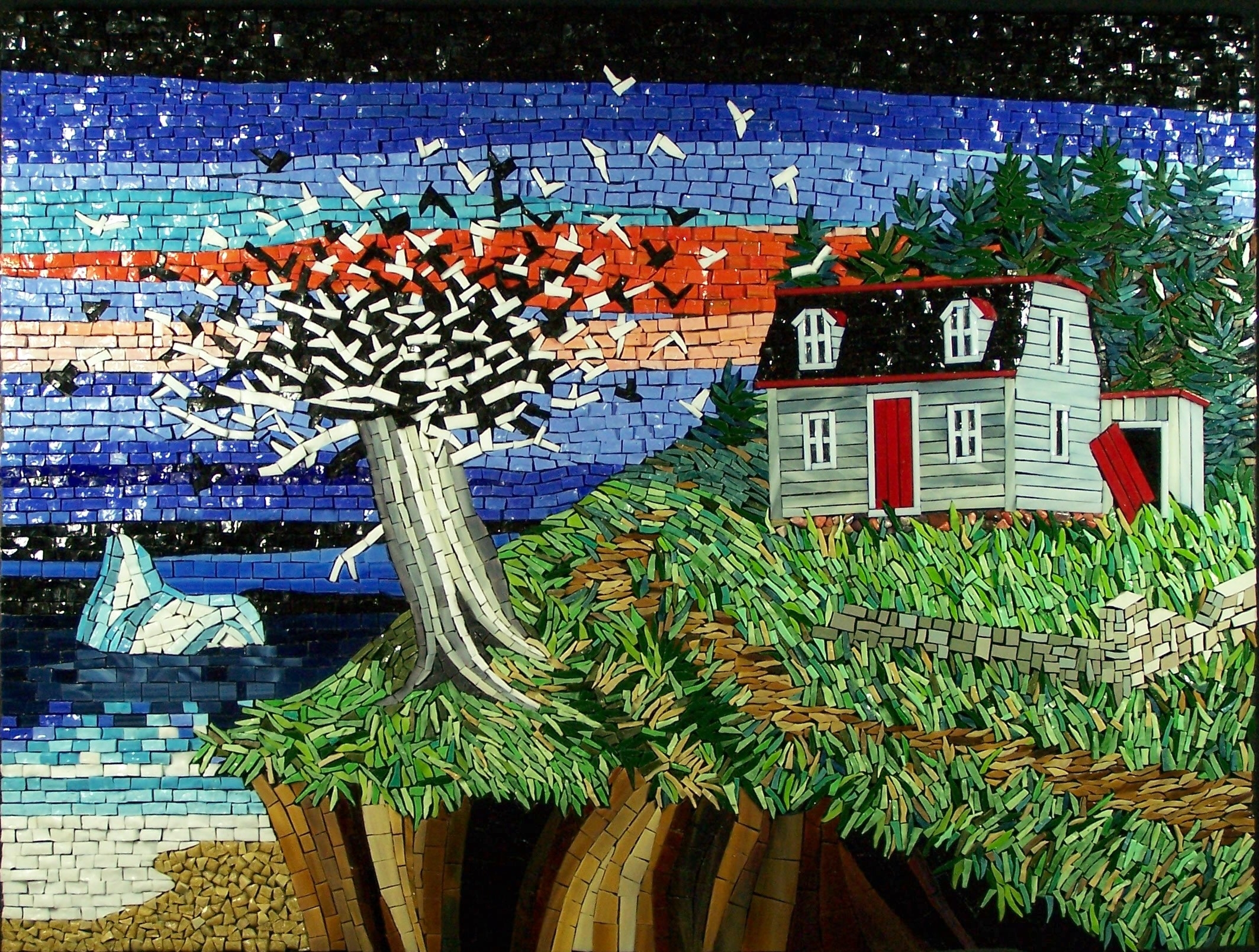
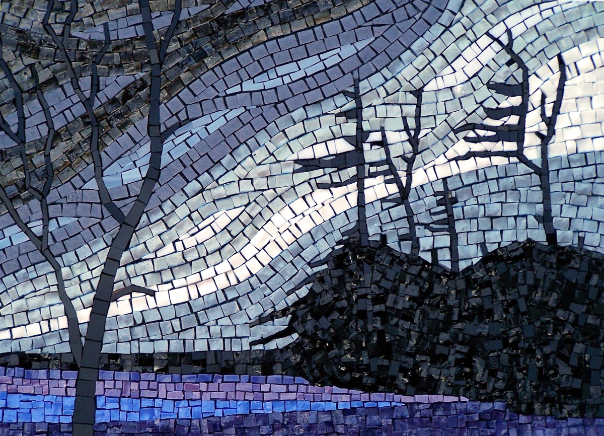
There is a sense of space that Terry creates by keeping landscapes wide open and compensating for the absence of figurative detail with increased texture and pattern.
These patterned and textured areas suggest fine repetitive detail in landscape elements seen at a distance: waves on the ocean, grass-covered hills, etc.
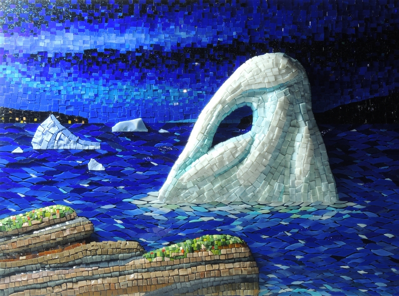
The patterns of color variegation and texture are often severe to the point of abstraction yet they are not overwhelming. They help suggest the image being rendered as much as they call attention to their own abstract nature.
That is a fine line to walk. For me, it shows a high level of artistic judgment.

An Exception to the Rule
I cringe giving artistic advice because there are are exceptions to every rule. I love it when people email me counter examples of general recommendations.
That’s another reason I like Terry’s landscape mosaics. They are the opposite of what is generally recommended in compositions: avoid empty areas and increase visual interest by filling the space with figures. For example: put a driftwood log on that beach. put some cows in the field. etc.
Terry creates visual interest with texture, pattern, and variegation, but he avoids figurative clutter.
Note the “emptiness” of the lower left foreground of the image below. It isn’t empty. It’s a carpet of vegetation down below the vantage point. It’s lack of detail helps suggest the height of the vantage point.
Terry’s intent is to conjure the vast empty places of the Canadian wilds, and I think he succeeds very well, to the extent that even a mood and a bracing coldness are conveyed.
A Sense of Place
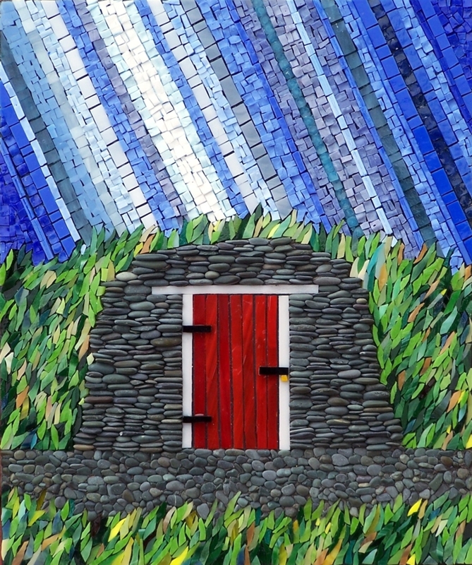
I think there is a recognizable style and mood in Terry’s work that is very much inspired by living in St. John’s, Newfoundland and Labrador
Leave a Reply