There’s a reason art instructors recommend working in monochrome or black and white before working in color.
The reason is that contrast in value (light versus dark) is more important than contrast in hues, and it is easier to learn mastery of value contrast before you complicate the process with different hues.
I am self-taught, and so I find myself relearning fundamentals all the time, but I have heard some highly-skilled painters and some highly-trained artists say the same thing.
Art is about paying attention and seeing and “listening” to the art as it evolves. An artist is always learning and relearning by definition.
My mosaic inset project has reminded me of the importance of value contrast.
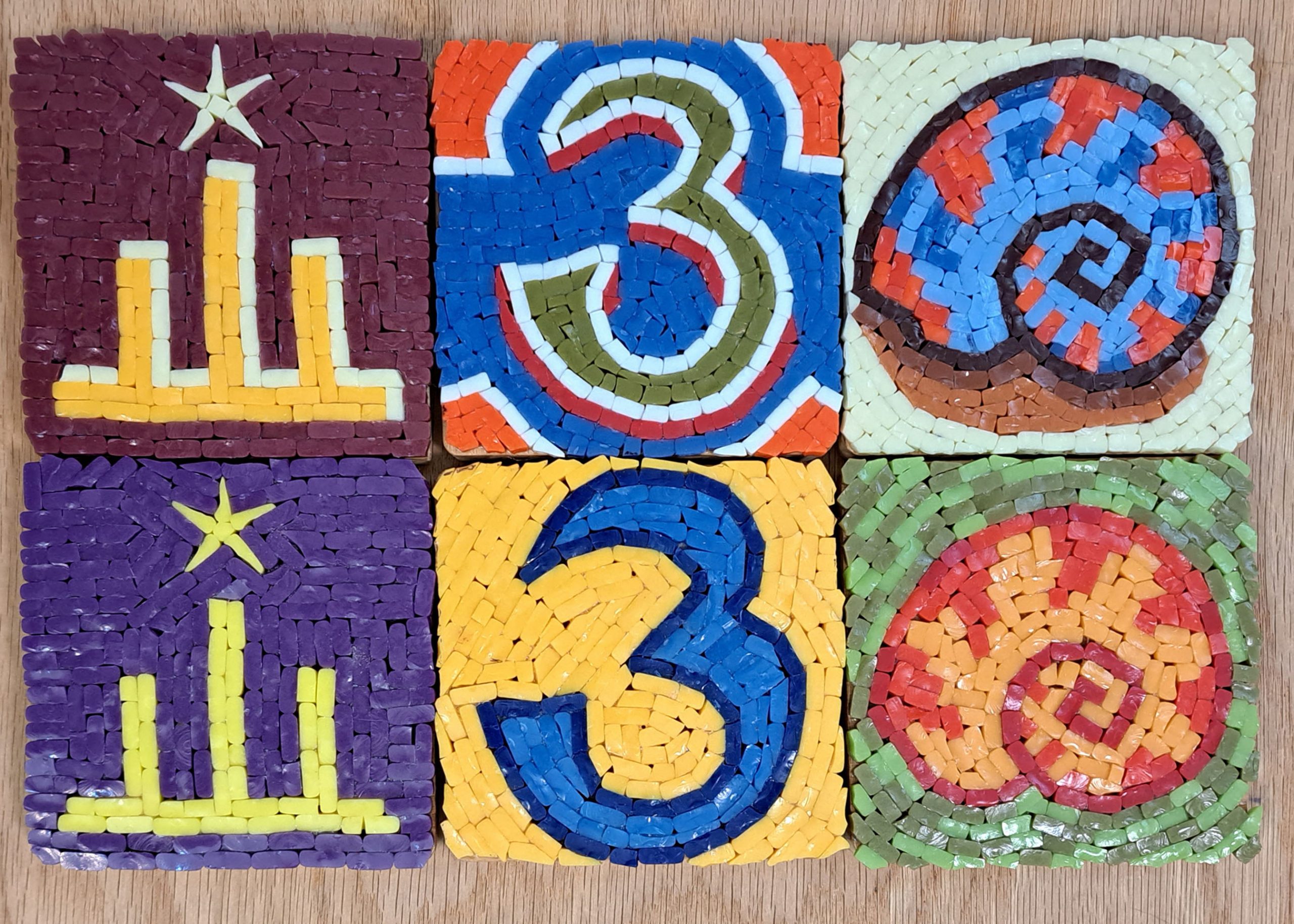
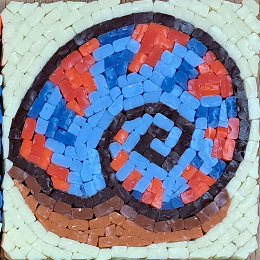
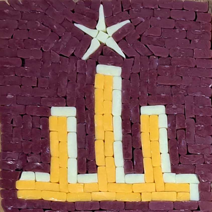
The headline photo in this article shows two different version of three subjects.
The three mosaics on the bottom were made with little or no contrast in value, and those on top were made later and make better use of value contrast.
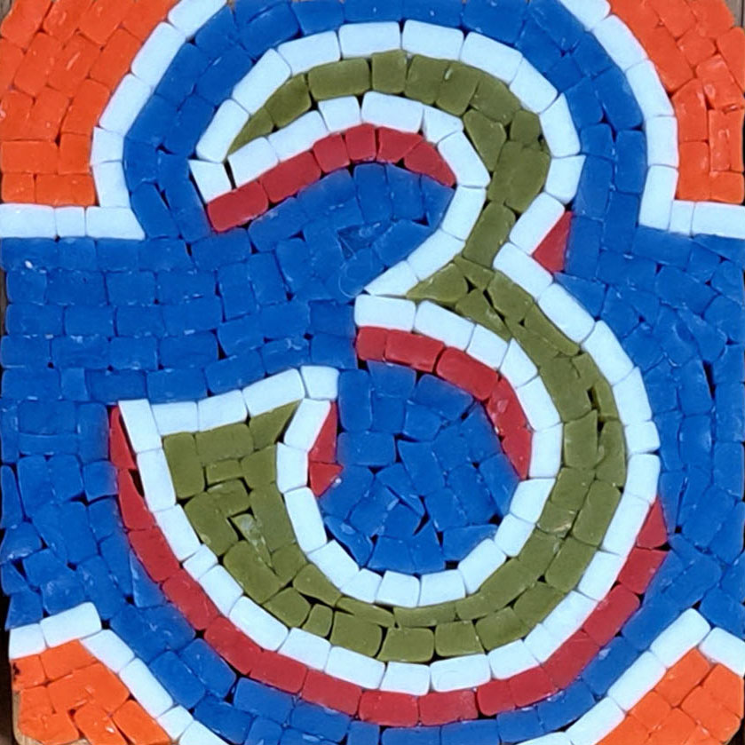
They are also more elaborate in design and include things like highlights or shadows, the usual roles of value contrast.
The mosaics on the bottom were made initially when I was still getting accustomed to working so small with tiny pieces, but even then I had enough skill to have made more elaborate designs.
I hate to admit it, but I made a conscious decision to keep the designs simple for a couple foolish reasons.
The first reason is that I told myself that I needed each iconic image to be as simple as possible to stand out as being a symbol, but that was foolishness.
Images always stand out better with contrast in value.
Planning Cuts
The second reason was that I was focused too much on creating good teaching examples of how to lay out tile with minimal cutting, using as many whole tiles as possible.
Note that by “whole tiles” I am not counting the initial cut to expose the cut surface. I am referring to pieces that didn’t require any more cuts.
It takes some thinking and puzzling to figure out how to render something without cutting each piece to size and shape, and this is particularly important when the mosaic is small and the pieces are tiny.
The novice mistake is to start cutting tile and work until you hit a detail that is too small to be rendered in the piece size you have been using or too small to be cut and handled.
Plan your design. By “plan” I mean spend some time thinking after you draw you draw your pattern. Think about how the tile will be laid out and “flow” in rows. Think about places in the design where pieces need to be cut thin or small.
You want to find a solution for these most problematic areas, ideally a solution that builds these areas out of pieces you know how to cut consistently.
If you spend five or ten minutes cutting pieces of that shape and size, and you find that you can’t do it without wasting most of the pieces as unusable scrap, then you need to rethink your design and redraw it if necessary.
Note that all six of the mosaics in the photo are what I consider designs that were well-planned in terms of building the image from as many whole tiles as possible and from as many “easy to cut” shapes as possible.
Unusable vs Usable Scrap
There are three types of scrap: slivers/crumbs, odds, and usable scrap, which is pieces that can’t be used in a particular place but could be used elsewhere.
This latter type of scrap is common and to be expected for detailed work. Most of your cuts won’t be the right size or shape you need for a particular point in a mosaic, but that’s OK. Many of these pieces will be perfect for other places or use in other mosaics.
PRO TIP: Cut up 5 or 6 pieces and use the piece that fits best instead of cutting until you have a piece with perfect fit. Tolerate a certain level of error to create an incidental grout gap based on imperfect shape rather than artificially spacing tiles.

Leave a Reply