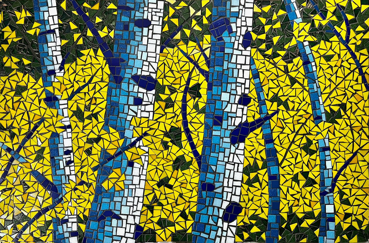
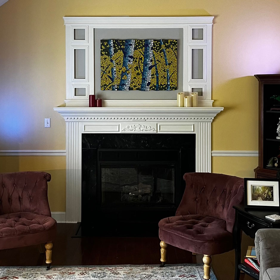
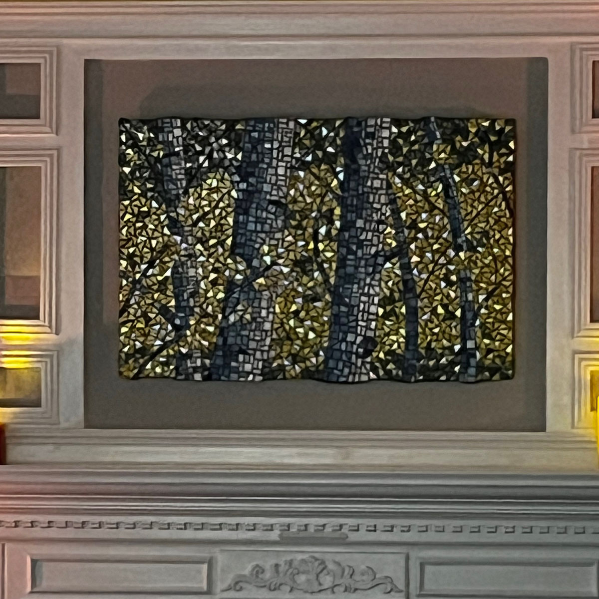
Artist Michael Hayes recently completed a mosaic based on a photo he took of an aspen glen in Colorado several years ago.
I wanted to share this mosaic for several reasons and not merely because it is a strong work by someone just starting out with mosaic.
Contrast of Hues
Contrast is critical for creating images that are visually interesting. Notice how the cool blue and warm yellow make a great contrast. If you are stumped for a color scheme, look at a color wheel online for a starting point.
Keep in mind that the color palettes available in tile are limited to a finite number of colors, and a big part of the process of creating a mosaic is finding a way to render the image with the available colors. Unlike paint, which can be blended to any hue or tint, tile colors are fixed.
One way of working around this limitation is to make the mosaic larger and cut the tile smaller and then create color fields that are a mix of small pieces of different hues.
Contrast of Values
Value contrast (light/dark contrast) is even more critical than hue contrast for creating strong images. If you don’t understand what I mean by that, think about how strikingly “real” black-and-white photographs and drawings can be.
Black and white and various shades of gray aren’t the only way to achieve value contrast.
In Michael’s composition, look at the trunks of the aspen trees and notice how they are composed entirely of tiles with a blue hue. (I think even the “white” tiles have a slight blue tint, but I could be wrong about that.)
Also notice the sense of lighting and dimension that is created by using these white or lightly tinted tiles with the lower value (darker) blues.
The yellow leaves versus the dark green of the forest in the background is another contrast in value that gives this mosaic a sense of depth.
Never forget that value contrast is essential for creating a sense of light and depth.
TIP: Planning a composition should always be done with value contrast in mind.
Semi-Abstract
Viewers always have a more objective appreciation for a work of visual art than the artist who created it. The reason is simple: The artist is biased by the version of the image that exists in her head and all that she intended to accomplish in the image.
The viewer is completely free from those specific preconceptions. (Although it is worth noting that we all bring a lot of biases based on culture and expectations from other works of art.)
Not being encumbered by what the artist intended, the viewer can only see what is there (or what cultural conditioning associates with what is there.)
That is why Michael was somewhat surprised when I told him that I thought the composition was even stronger for its semi-abstract qualities.
The choice of uniform triangles for the leaves instead of something more leaf shaped was inspired in my opinion. Not only did it avoid the tedious absurd task of trying to shape each leaf, it also made this figurative composition more abstract in nature.
Now, artists who struggle to make figurative representative art might think of this observation about abstract qualities as a slight or a disparaging comment or something negative.
Far from it, the abstract aspects of this figurative composition make it MUCH more interesting to people who have spent years and years in the studio.
Iridescent Glass as Accent
Michael used iridescent glass tile in the best possible way: Instead of using the iridescent to make the entire composition or an entire element in that composition, Michael sprinkled iridescent accents through the composition as a whole.
Specifically, Michael scattered iridescent yellow tiles throughout the regular yellow tiles used for the aspen leaves which dominate the composition.
Leave a Reply