Many artists like to choose background colors after the central figures have been tiled.
It is best to tile from the middle and work toward the edges to avoid awkward spacing between at key focal points, but you should not leave the color choices for the background as a complete afterthought.
Nor should you have firm color requirement for the background and tile the central figures without placing that color next to them just to see if they work.
Avoid “painting yourself into a corner” by doing a lot of cutting and mounting without thinking ahead.
“Thinking ahead” can be as simple as placing a single tile next to what you are tiling now to see if it has adequate contrast.
Color Constraints
The colors you can use for a particular detail are constrained by the colors that have already been used. This is true for three reasons:
- There must be adequate contrast between adjacent color fields, especially figure versus background. When in doubt, look at a color wheel online and pair colors from the opposite sides of the wheel for maximum contrast. You should also consider light/dark contrasts.
- There are also the specific requirements of what is being rendered. For example, lush wet vegetation will probably involve some greens, and an old rusted red barn will use some reds and browns.
- There is also the need to distribute colors around the “canvas” in a way that makes an aesthetically pleasing design instead of one that is less interesting.
All of these factors mean that you can’t leave the choice of background color as an afterthought.
This applies even when the color selection available is fairly complete (smalti or stained glass), and it definitely applies when you are using the more limited color palettes of materials like recycled glass tile and vitreous glass tile.
Make Haste Slowly
Over the years, customers have sent me thousands of photos of mosaics in progress, and many of these emails have been requests for advice on background colors or some other element that was left until the end. Often times the pictures will show half the background already halfway tiled, representing days of work cutting and gluing down tiles.
That is a lot of work only to find that you don’t like how the color looks with the rest of the mosaic.
How do you avoid wasting all that time and effort?
There are two ways to ensure you recognize poor color choices before you invest a lot of time:
- Instead of plowing ahead and thinking about “just getting it done,” allow yourself to sleep on it and look at the mosaic in the morning with fresh eyes. Make sure you listen to your initial gut reaction on the color itself and ignore how well the tiles are cut and placed. Don’t talk yourself into liking it just because of the work you have put in.
- Work on more than one visual art project at a time and switch back and forth between them.
- Use a temporary surface (such as lime putty or contact paper upside down) with mosaic mounting tape instead of gluing down one tile at a time.
This last point about using a temporary surface allows you to lay out the whole design (without the tiles moving around) and change it as needed before you glue anything down. It saves you much time and effort, and that helps you see your work more objectively and critically. It also makes changes much easier.
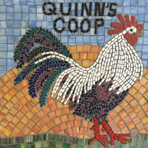
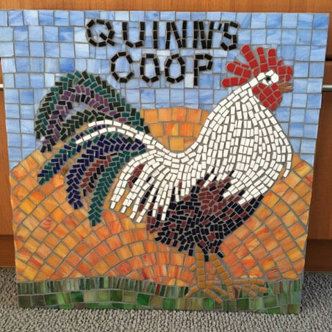
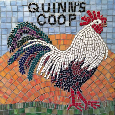
Case Study: A Rooster’s Legs
Artist Linda Lawton recently emailed us some work-in-progress pictures of her Quinn’s Coop mosaic, which is a figurative depiction of a rooster in profile. Linda wanted advice about what to do for the background, and I suggested that she consider warm pinks and oranges. I was thinking about vaguely horizontal but amorphous clouds in those colors, with the whole sky lacking much definition.
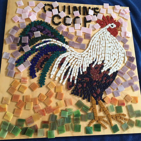
In the color study Linda did, she considered a purple that wasn’t as warm as what I had in mind because of the limited colors that were available in the stained glass tile she planned to use, and she needed something dark enough to contrast the white feathers.
Also, Linda wanted an iconic rising sun in the background, and so I believe she was already thinking in terms of a blue sky to contrast the orange sun.
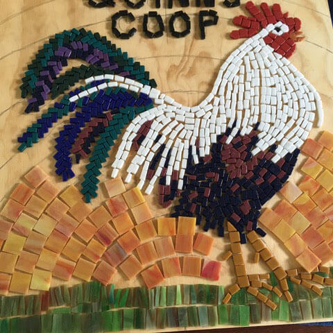
In the second color study, we can see an emerging problem: the orange of the legs won’t contrast the sunrise in the background enough to stand out. They are too similar.
Linda finished Quinn and grouted him, hoping that the grout would help the legs stand out more, but that didn’t really change things because there is the same grout gap in the tiles used in the rising sun.
Linda emailed us for advice, and my initial response was in terms of the colors already used in the mosaic, either red or white. (Black or a similar dark color wouldn’t contrast the lower plumage.)
Now a rooster’s legs are neither red nor white, but works of art have there own internal logic, especially “posterized” designs such as mosaics where reality is simplified into distinct color fields. I thought the driving concern wasn’t a need for verisimilitude but rather to balance color distributions and to tie the rooster to the ground.
To explain my choices, I paraphrased a couple of quotes about art:
- Nature must be corrected.
- Don’t be a slave to the model.
All that being said, I thought that white would be too unnatural and went with red as my final recommendation of what I would try, with the understanding that the red tile would first be positioned on top of the feet just to see how it looked.
Linda removed the yellow-orange tile from the legs and replaced it with red, and she told us that it only took about an hour. Removing tile from a mosaic with no grout gap is more difficult, but the procedure is the same.
The final results work as hoped:
Leave a Reply