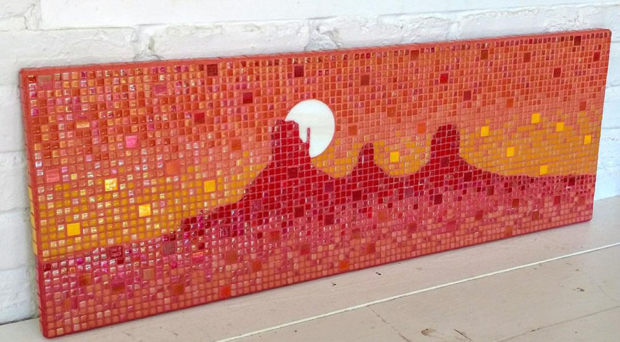
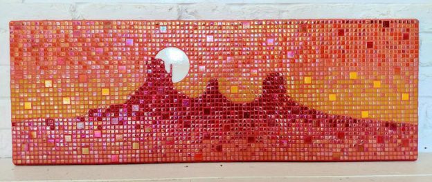
Artist Apryl Howard sent me some pictures of her recent Arizona Sunset Mosaic, and it is the exception to several “rules” I have recommended over the years. It is also a great silhouette landscape that captures the color of light and is worth seeing merely for inspiration and ideas for your own artwork.
By “the color of light” I mean that the colors are in harmony for that lighting, which contributes to a sense of the scene being real. I think Apryl’s mosaic is very successful that way. You can feel the heat of the white hot sun and the baking red rocks.
For reference, this mosaic is made from iridescent versions of 8mm glass mosaic tile, 15mm glass mosaic tile, and stained glass.
The work is so successful in spite of ignoring my recommendations (at least nominally ignoring them), that it convinced me that I should write a blog article called “Everything I Told You About Mosaic Art Is Wrong.”
Here are the ways in which Apryl’s mosaic ignores recommendations yet is still successful:
Stick To One Size of Tile
When amateur artists use multiple sizes of tile in the same mosaic, they sometimes use one size for one part and a second size for another part or element or figure of a similar size, and that can look odd or distract from the scene being rendered.
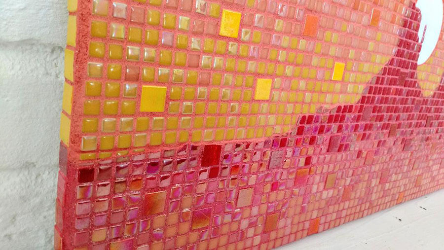
Apryl avoids this problem by scattering 15mm tiles randomly yet uniformly throughout the mosaic as an abstract element. The larger tiles aren’t clustered together to form one particular part of the land or sky. Think about how odd it would look if one of the volcanic shiprock formations just happened to made from 15mm tile but the rest of the landscape was made from 8mm tile.
Avoid Working In A Grid
One of the more interesting aspects of mosaic is the placement of tile and the different patterns that can be used to define figures. Working in a grid is the most visually monotonous of the modes of working, and so it is better to avoid it if you are trying to make mosaics that are as interesting as possible.
Apryl uses a grid, but she breaks up the monotony by the random 15mm tiles scattered throughout the mosaic.

Build Curves From Small Pieces
In traditional mosaic, curves are built up from small pieces that are not curved, like a Roman arch made from individual stones that aren’t curved.
It isn’t practical to nip glass into a circle because compression tools frequently cause the glass to snap in unexpected ways.
I told people that if they wanted to cut curved shapes from stained glass, they should use the pistol grip cutter to do so, and they should probably use such pieces in a mosaic where all parts were cut “stained glass style” instead of mixing that style with conventional small-tile mosaic.
Again, Apryl’s mosaic ignores these recommendations about curves and not mixing large stained glass components with small-tile mosaic. The reason Apryl’s mosaic still works is that it is done in only one place, and that element (the sun) is a unique central figure.

Avoid Matching Grout Colors
Matching grout colors to tile colors (such as brown grout with brown tile) can destroy the mosaic effect visually so that individual tiles are no longer distinct.
Apryl uses matching grout colors, but the individual tiles are still visually distinct because they are iridescent, which contrasts with the matte finish grout.
Avoid Multiple Grout Colors
Apryl used multiple grout colors, and usually I tell people to avoid this because it is more work, and it often doesn’t accomplish much (based on pictures of mosaics and opinions of people who have done it).
In conventional mosaic, grout is supposed to be like the pencil line in a watercolor painting or the lead channel in a stained glass window. Grout isn’t supposed to be a source of color for the most part, unless you are using larger than normal grout gaps.
In Apryl’s mosaic, the darker grout for the land made it more silhouette like, and so it probably was worth doing. It was also relatively easy to do because the land and sky have a relatively simple boarder that was easy to mask off.
In several ways, Apryl’s Sunset Mosaic really is the exception that proves the rule.


Leave a Reply