In my post, “Agonizing over Mosaic Icons,” I discussed artist Sue Hague’s mosaic reproductions of Greek Christian icons, and the troubles she was experiencing due to the grout gap.
My advice to Sue was to eliminate the grout gap in her future work because these icons weren’t architectural surfaces exposed to the elements. The grout isn’t needed. Make the tiles touch. You couldn’t do this on a backsplash, but for an icon or plaque; sure, no problem.
I am pleased to announce that Sue took the advice to heart, and the results are soooo good.
The Joy of Work
Art is easy at first, nothing but excitement and exuberance, and nothing is wrong.
Then the artist who is serious about improving her artwork soon discovers that art can be work, serious work, requiring the same sort of intensity and focus as an engineering problem.
Most people don’t know how to put in that extra effort and still have fun, and so they give up trying for something more in their art.
Most people are happy to figure out one method of working and are content with that.
And even if they aren’t content with the results, they lack the courage and discipline required to find another way of working.
But some of us love the time we spend working in our studios, especially the time spent figuring out something new.
The Studio
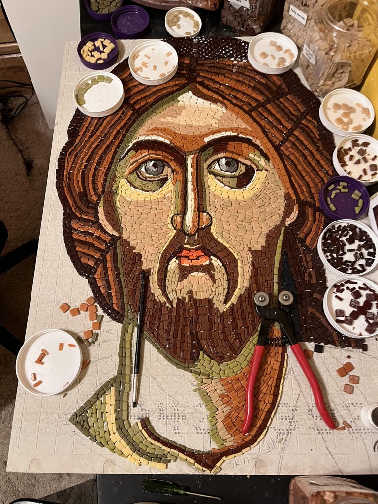
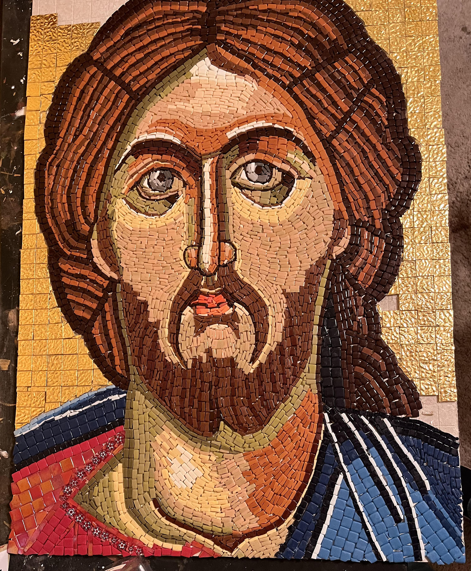
The following photo is a work-in-progress snapshot of the Christ Mosaic Icon in Sue’s studio. Notice how the highlights provide a contrast in values which creates a sense of depth:
Larger is Easier
The above mosaic is 21 x 31 inches. It is made with “ordinary” 12mm Morjo™ Glass Tile and the “ordinary” Mosaic Glass Cutter we sell. What I mean by “ordinary” that is there isn’t any stained glass or smalti in it or special tool required, and yet look at the color variegation and detail that are possible.
As a general rule, larger means easier for mosaics, at least until weight becomes an issue.
With a large size, you can variegate color more easily and render details more easily.
There is more “real estate” to work with, and not as many difficult cuts are required.
Ideally you want to have to only cut the tile once, with most cuts being only a loose halving of the tile, at a few basic widths and angles.
Most people do not want to cut tile into quarters if they can help it, at least not small 8mm tile. That is why my Mosaic Door project isn’t a good teaching example.
Transliterated by a Master
Sue’s inspiration is one of her all-time favorite icons, a painted Greek icon of Christ from the 14th century, the “Golden Age” of iconography:
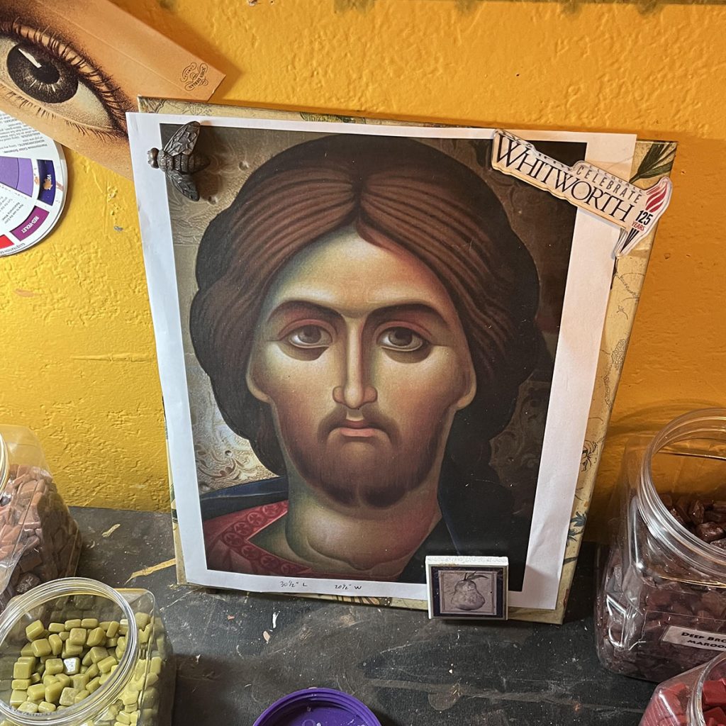
Sue tells me that iconographers say they “write” an icon when they make one.
This choice of verbs emphasizes the fact that the icon is more than a picture but also less than what it represents. The icon is not intended to be worshipped. The icon represents God but is not God.
I think “write” is a good choice of analogy for the process because when you execute the image in mosaic, it is an exercise in transliteration and not just translation.
There is a completely different alphabet in mosaic. There is no blending or shading, only a finite color palette of a few dozen possible options.
That’s a completely different way of working.
First, the image must be “posterized” or reduced to basic color fields, such as used in old lithographs.
Then each color field has to be approximated with 1 or 2 of the colors that are available.
Color choice is a process of elimination based on contrasts with colors already used.
Sometimes it can feel like playing a game of chess to come up with a whole color scheme that works for all places in the image.
Inevitably there will be one place in the mosaic, one particular detail, where if you use the color you are planning to use, then there won’t be enough contrast in that particular place.
When that happens, you sometimes have to modify that particular detail by redrawing it so that the color can be used. After all, there are only a few dozen color choices possible.
To make it work requires some judgment and effort.
I can’t put into words how good of a job Sue did with this transliteration of the image into mosaic.
The andamento is well done, very classic, and this is my favorite aspect of mosaic.
Old-School Mosaics
I love painting with stained glass, but old-school mosaics built from a limited color palette of monochrome tiles are Mosaic with a capital M, the very essence of Mosaic.
In these mosaics, the flow of the working lines (rows of tiles) correspond to the flow of lines in the image.
In this situation, the andamento helps define elements and is a key part of the vocabulary available to the artist.
Sue’s mosaics is a masterpiece in this regard.
Mixed-Media Mosaic
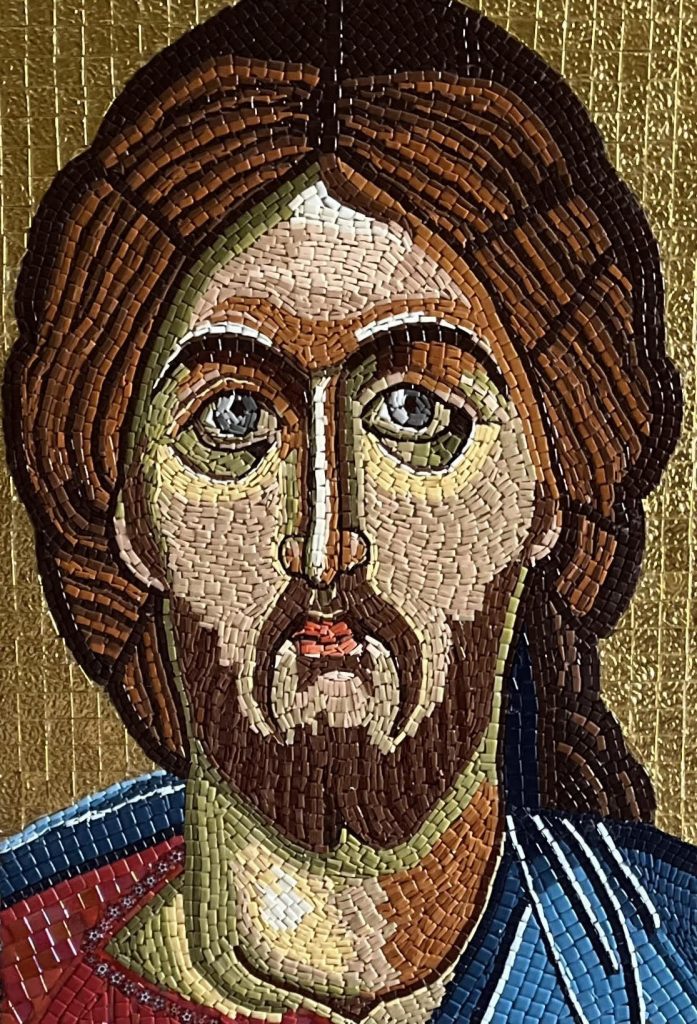
In another sense, mosaic is less limited than painting because it is easier to include other materials. Notice the gold-leaf glass background in the mosaic below:
Materials and Methods
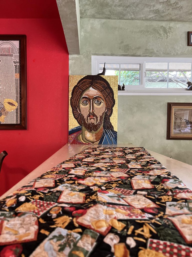
This mosaic was mounted on Hardiebacker brand tile backerboard and is 31 x 21 inches in size. The glass is mostly 12mm Morjo™ Glass Tile with a background of gold-leaf glass.

Leave a Reply