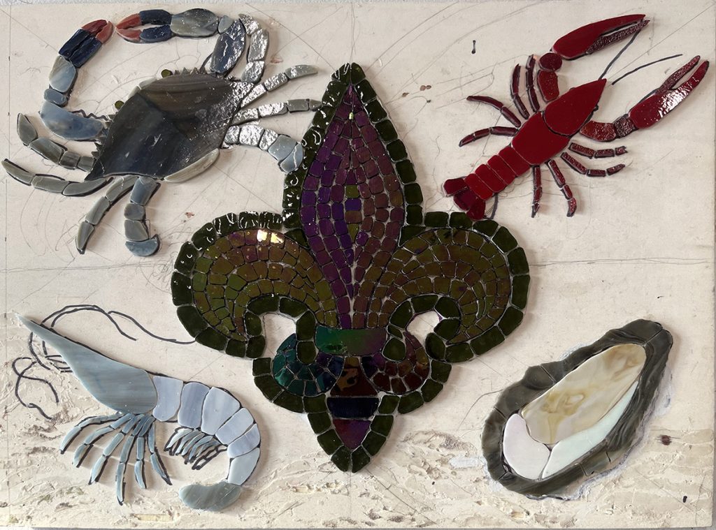
Artist Sharon Thomassie emailed me a photo of her mosaic in progress and asked for advice about choosing color(s) for the background.

The following was my reply:
I’m so glad you emailed me because a poor choice in background color can destroy a mosaic, especially when there is insufficient contrast with the figures.
Since most of your figures except the crawfish are medium grays with a warm tone, the background needs to be colorful with a cool tone. Usually that means a blue or a green or a combination of the two.
Since your figures aren’t intense in color, the cool-tone hue you use for the background shouldn’t be super intense.
If you don’t mind, please lay a few pieces of glass on the mosaic and take a photo for me to show what options you are considering.
I usually have to work by trial-and-error like that and just try out different options before committing.
Background Color
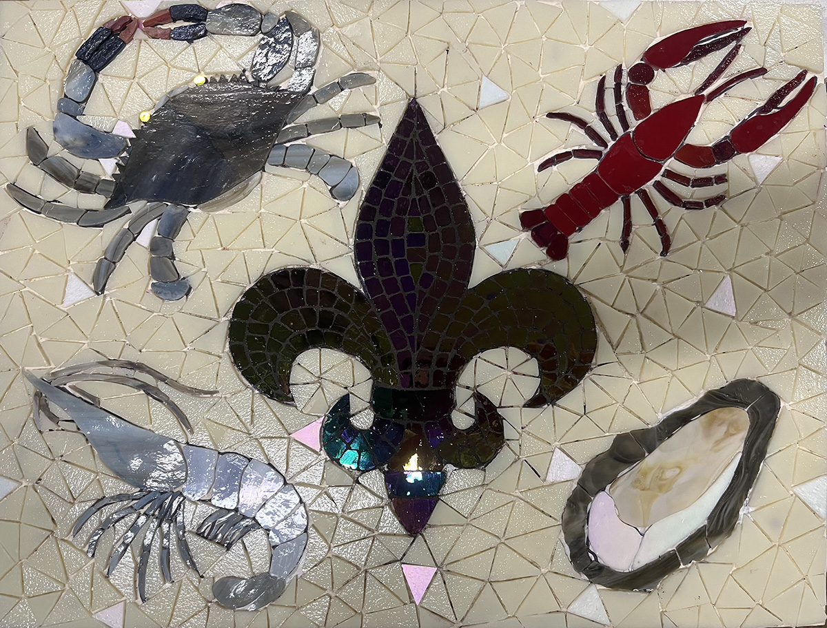
Notice that Sharon did NOT use a cool tone for the background of the mosaic:

Sometimes I type in haste and don’t use the best choice of words. Where I said “needs to be colorful with a cool tone,” I should have replaced “needs” with something to the effect of “probably should be according to general rules which always have exceptions.”
While Sharon didn’t use my specific recommendation of a cool tone such as a blue or green, she did use my idea for finding a background color by a trial and error method.
That method is as simple as placing some tile on the mosaic and seeing if that particular color works with the figures in the mosaic.
The warm cream color Sharon chose for the background instead of a blue or green tint is probably optimal for contrast.
When I take a longer look at the grays used in the shrimp and crab, I notice that there are blue notes in the gray.
For that reason, a warm cream is the better contrast.
I also like how the cream is in harmony with the natural colors used for the figures.
Grout Color
A poor choice in grout color can also ruin a mosaic, especially when the grout gaps are wide.
PRO TIP: If the grout gap is narrow/hair-thin, the color impact of grouting is minimal.
That is why I always use a minimal or incidental grout gap for icons and other dry indoor mosaics that don’t need to be protected from water penetrating to the adhesive.
Once Sharon completed the background, she emailed me a photo of the ungrouted mosaic asking for advice on the choice of grout color.
Here is my reply to Sharon:
There are different options for the background grout color:
The color for the background grout could be something subtle in harmony with the cream tiles so that the grout didn’t stand out too much, but if it matches the color too closely, the individual tiles are no longer visible as individual tiles, and the mosaic effect is lost.
An opposite extreme would be to use black grout so that the grout line looks roughly like a fishing net on which all the seafood is resting.
Grays that match the color of the seafood would be problematic. For example, you wouldn’t want the grout line to look like an extension of the oyster shell.
Given that there is so little intense color in the figures, I wouldn’t want the grout line to provide more color than the tiles.
I’m kind of naive and conservative in the sense of not taking risks with grout colors, and so I would be inclined to go with back for a fishnet effect.

Lighting and Color
Color is reflected light.
For example, if there isn’t any blue in the light, then blue tiles will look dull even grayish, and all colors will appear warmer and more yellow than they would in full-spectrum light.
Indoor light sources are usually warm in tone and lacking in blue light. This makes indoors a poor place for photographing artwork, unless you purchase full-spectrum light bulbs.
The opposite problem can happen with outdoor light on overcast days. If the sky is too overcast and the cloud cover is too thick, then the light will be deficient in warm tones.
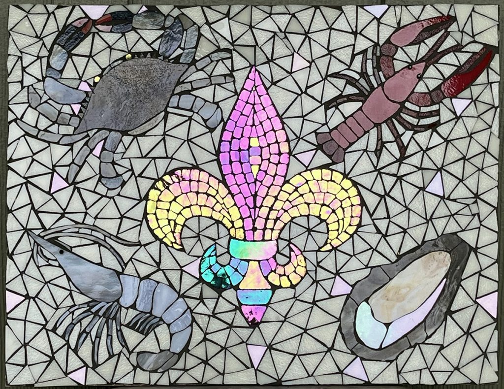
The photo of the finished mosaic above was taken in outdoor light on an overcast day, and the light had less warm tone than desired.
Notice how the cream tiles of the background look a little washed out in this light instead of having a yellow note.
The best light for photographing artwork is early morning or late afternoon when the sunlight is diffuse and not glaring like mid day.
Place the artwork in a place without any direct sunlight on it for best results. You want to avoid having direct sunlight such as a sunbeam shining on the mosaic, because there will be a glare of glossy highlights that obscure the image.
Iridescent Colors
Sharon’s photo of her finished mosaic is optimal as far as showing the iridescent colors of the fleur de lis.
Iridescent tile mosaic is difficult to photograph because the color of the iridescence changes with slight changes in viewing angle, and the same angle isn’t best for different tiles.
Another problem with rendering detailed figurative mosaics with iridescent glass is that the iridescence overwhelms the underlying color.
How can an orange petal contrast with a green leaf if they both can look like every color in the rainbow depending on the viewing angle?
Sharon’s mosaic uses the iridescent glass in a more intelligent way. It’s all in the one large figure (the fleur de lis) surrounded by non-iridescent tile.


Leave a Reply