The background in a work of mosaic art serves two purposes:
- contrast the colors of the figures in the foreground.
- suggest motion by arranging the tile in contours around figures.
The first point is obvious, but the second is often overlooked even though it can make the difference between a great mosaic and a mediocre mosaic. The background isn’t supposed to be just empty space to be filled as quickly as possible with a grid of tile similar to how bathrooms are tiled. Consider Van Gogh’s Starry Night and how motion is conveyed in the directionality of the brush strokes:

A Good Teaching Example
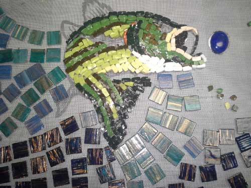
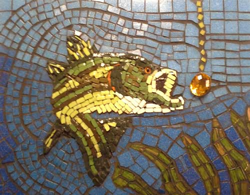
A friend recently emailed me a photo of a mosaic in progress and asked me for advice. Specifically, he wanted to know what type of tile and what color would best work for the background of a mosaic of a bass (fish) he had made from the 12mm C3 Recycled Glass Tile. The project was interesting because he wanted to make the background from a different type of tile than he had used for the fish, and there were other color constraints: the bass would be swallowing a large blue glass cabochon gem, and there would be green water grasses at the bottom.
These constraints made the project a good teaching example for the simple reason that many artists work this way, especially naive artists and artists who work in a more exploratory way (as I do). Instead of copying an existing design verbatim, these artists will create the central figure or figures first, and then select a background color and additional figures based on how well they work with the central figure already in place. This mode of designing by trial and error is a natural consequence of working with limited color palettes. (Tile colors can’t be custom blended to any hue or shade like paint, so you have to select a background colors from what is available.) The trial-and-error mode also comes naturally when you are trying to incorporate specific found objects into a mosaic, such as the blue cabochon gem that my friend wanted to use in his.

Use Contrasting Colors
The image above was included in the original email requesting my advice. My fresh unbiased eyes could immediately see that the green metallic tiles would not fully contrast the colors in the bass. I could also see that even the blue metallic would not work because the golden sparkle of the copper aventurine dust gives the blue glass an overall greenish cast.
In fact, using blue tile of any type would be problematic if the blue cabochon gem is used. So I presented two alternatives:
- Use light pink or orange colors for the water, such as might be seen in late afternoon.
- Replace the blue cabochon with an orange cabochon.
The first alternative appealed to me for two reasons. First, warm colors such as light pink or orange are more appealing in general. (Basic biopsychology: the brain likes warm colors.) Second, art with non-obvious color choices is usually more interesting. (If the sky ain’t always blue, why do we always have to color it blue without first questioning the instinct to do so?)
An esoteric digression: This second point touches more sophisticated questions about visual art: Does an object have an intrinsic hue, or are the colors (plural) it reflects at a given instant a function of the color of the light shining on it at that particular instant? The answer is obvious to our eyes but not to our memories. Our memories tend to be more verbal than visual, and we remember things in a more archetypical mode: monochromatic “green trees” and “blue skies” and not the myriad of hues that they are in real life.
Following Design Fundamentals Won’t Do You Wrong
My friend decided to replace the blue gem with a golden yellow one and use blue tile for the water. These conservative design decisions work because they follow fundamental principles: The blue tiles contrast the greens of the fish and water grasses and the yellow of the cabochon.
Of course my friend could have tried light oranges or light pinks for the water, but that would have involved more risk and more trial and error than would have been advisable on an early project such as this. I will write an additional blog post about how this particular mosaic could have been improved, but I will also write about the problems of artistic advice and how advice in general doesn’t work well in a one-size-fits-all mode.


Leave a Reply