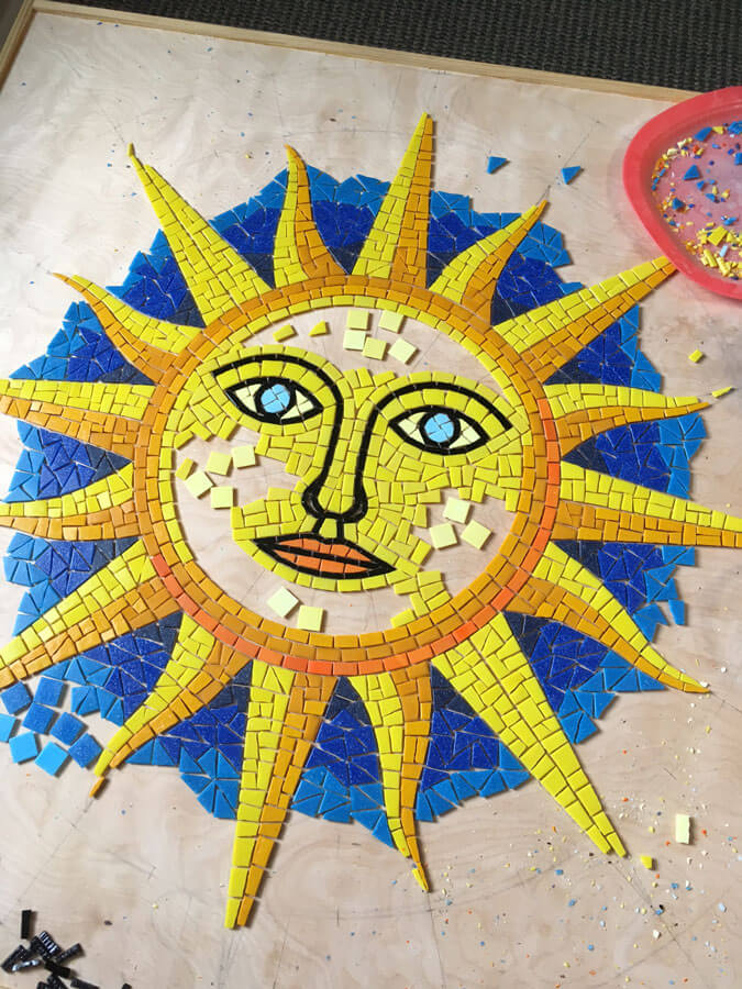
You can increase visual interest in your mosaic by using variegated colors (multiple colors in patches or streaks) instead of monochromatic fields of only one color. This technique is particularly effective if your design is relatively simple and made from outlined areas of color like a coloring book or cartoon.
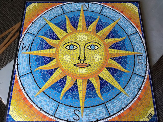
Artist Marie Powell’s “Sun Compass” mosaic table top is a great example of using variegated color fields and color transitions to make an otherwise simple design as visually interesting as a naturalistic rendering of a real object.
Variegated Color Fields
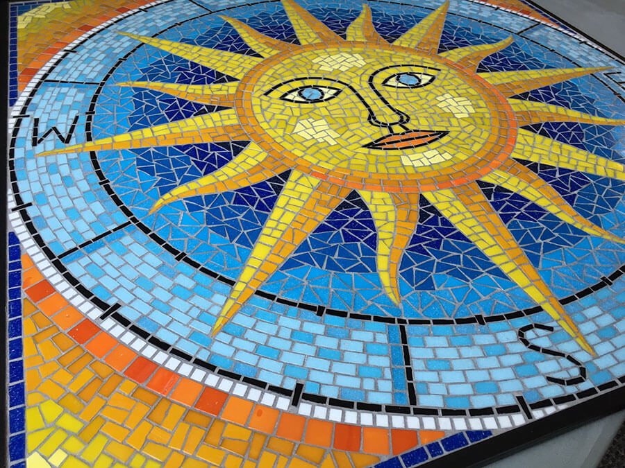
Notice how the blue compass ring which contains the directional letters (N,S,E,W) is made from two different light blues in a random variegated pattern instead of only one color. Notice how the sun’s face is a variegated arrangement of two different medium yellows, and there are highlights of lighter yellow on the cheeks, chin, and forehead.
Color Transitions
Notice how the blue background around the sun is deepest blue next to the sun and becomes progressively lighter moving outward. Having the darkest deepest blue next to the sun also increases the contrast. Similarly, the warm background around the compass ring starts orange and transitions outward to a light yellow.
Contrasting Colors
One of the reasons Marie’s design is so strong is that it makes use of complimentary colors from across the color wheel: orange and deep blue, yellow and light blue. Also notice the band of white tiles running around the black outline of the compass ring.
“Color Outside The Lines”
Note the concentric rings of blues around the sun and the warm colors in the outer edge do not have perfectly circular boundaries but instead are more loosely defined. Yes, this design does make use of tightly outlined figures, but Marie kept her artist’s eye open and did not execute the design like a robot (which often happens due to the repetitive nature of making a mosaic and the amount of labor required). Instead, Marie made the color transitions look more like transitions instead of rigidly distinct rings.
Shadows and Highlights
Notice the highlights on the sun’s face and how each of the rays has a yellow side and an orange side, which suggests light and shadow. Think about how much interest these simple elements provide. Think about how less interesting this mosaic would look without these simple techniques.
Work Slow: Look and Listen
Work slow and don’t rush the project, else you are likely to miss easy opportunities to make the design better.
Look at your work with fresh eyes each morning, and listen to your initial reaction instead of rationalizing how you think it will look once it is complete. Listen to what your design is trying to tell you and what it needs.
Leave a Reply