Yosemite Mosaic Landscape

Limitations of the Grid and Tile as Pixels
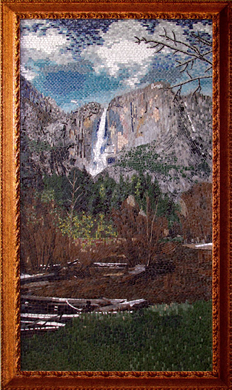
Jim Price’s Yosemite Mosaic is an excellent example of how photorealistic mosaic art does NOT have to be rendered in a uniform grid of pixels.
For an example of a gridded mosaic where tiles are used as pixel, look at the impressive black and white mosaic another artist Mark made of his grandson peering through a telescope. Note the contrast of styles between these two mosaics!
While the tile-as-pixel mode of working is very effective and straightforward for beginners, it limits the artist stylistically because tiles in a grid do not vary in shape and direction, and you can’t do things like arrange tiles in concentric rows around figures to suggest motion. You also can’t use different sizes and shapes to suggest the texture of surfaces. All you have is a grid, and the process of laying tile is all a matter of putting the right color in the right cell.
Alternatives to Grid Designs
You have more opportunity for stylistic flourishes if you work in a mode similar to stained glass artwork and used pieces with irregular shapes based on the figures being rendered, which usually means larger pieces –but not necessarily. Artist Lorna Ball’s stained glass mosaics are good examples of using small pieces to create realistic textures (bird plumage, tree bark).
I really admire the mosaic Jim Price made of Yosemite because it is photorealistic yet not pixelated, nor does it go to the opposite extreme and render in large pieces like commonly seen in stained glass artwork. Instead, the image is rendered in small tesserae (tiles), and the tile is used in rows that follow the lines of the figure being rendered. Rectangular tile is placed in staggered rows like the classic “subway tiling,” but it is not one uniform set of rows. Instead, different areas and different figures have their own set of rows at a different orientation from those row sets in adjacent areas. To see what I mean, look at where the tops of the cliffs (vertical rows thrusting upward) meets the sky (horizontal rows).
Every element of the composition works well with adjacent areas and objects and contrasting andamento (direction of rows) helps define areas as separate elements. It is clear Jim thought about the row schemes for different elements very carefully and spent a lot of time executing it.
Artists Comments
I wanted to do something big: (24” x 44”). This mosaic took me 20 months to complete, working approx. 3 hours a day using 3/8” tiles. I estimated 13,000 cut pieces. One of my toughest challenges was picking the tile colors. I learned to make do when I could not find all the exact colors I wanted. Grout was also challenging, picking the correct colors – it’s amazing how important grout is and how it affects the overall look of the piece. I used 2 grout colors, grey for the sky/mountains and a medium brown for the rest.
Let the Background Be Background
Note that Jim does not make contour lines around the clouds but instead renders the entire sky (clouds and all) using one system of rows of rectangular tiles that define the clouds impressionistically. This is just what the sky needs. The alternative would have been to render the clouds and the surrounds sky with flourishes of different sets of curved rows, but that would have given the clouds too much visual interest and made them look more like elements in the foreground.
Wheat Field with Crows
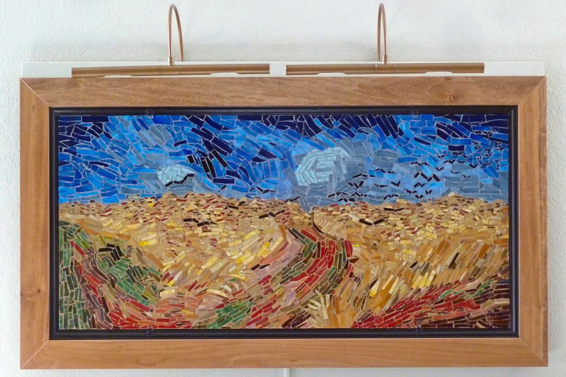
Jim Price made this mosaic master copy after Van Gogh’s painting of the same name, and I think it is good example of the emotion and energy that stylized artwork is capable of and why many people value that type of art over straight realism.
Nearly all of Van Gogh paintings beg to be copied as mosaics because the paintings themselves are already mosaics of heavy brushstrokes that make expert use andamento to convey a sense of motion. Everything dances in a Van Gogh painting, even in his still life paintings, but “Wheat Field with Crows” was a particularly good choice for interpretation.

Jim made his Wheat Field With Crows using Italian stained glass and says he has the cuts to prove it. I believe him.
Working With Stained Glass and Alternatives
Stained glass can form razor-sharp edges and slivers when it is cut, some colors more than others because the metal oxide pigments alter the physical properties of the glass. Molded glass tiles such as vitreous and the sintered recycled glass variety are a lot less sharp when they break and don’t produce as many daggers and needles, and so they are better choices when working with children, especially since you can choose to work with whole uncut tile or mostly uncut.
If you do work with stained glass, it is important to remember that nothing else will prick your fingers faster or more often, especially the tiny crumbs and slivers of stained glass that hide on work surfaces. That’s why you keep a vacuum handy and periodically clean off your work area.
Italian Versus American Glass
Our stained glass is all American made. I haven’t noticed much difference between American made and the limited number of sheets of Italian glass I have used as far as cutting it and handling it. As far as looks, I have seen sheets made in both countries that were too exquisite to cut up, but it seems like the Italian manufacturers try to make most every sheet swirled to that level of perfection. It seems like a lot of extra money for not much return if you are cutting the glass up small for mosaic art.
The Artist
Jim Price lives in Southern California. He has been a graphic artist for 53 years and tried every medium of art before realizing that mosaic was his true love. Contact the artist directly:
Jim Price
Jimprice888@gmail.com
805-584-6272

Leave a Reply