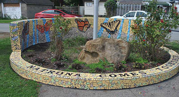
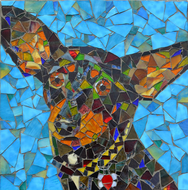
Artist Steven “Stevo” Sadvary has a broad mosaic portfolio of pet portraits, cityscapes, signage, educational murals and other public art, all solidly rendered.
I like public art that inspires people to make their own art, especially children, and I think there are a few things about Stevo’s art that make it optimal in that way.
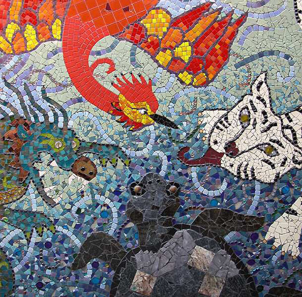
“Figurative Plus”
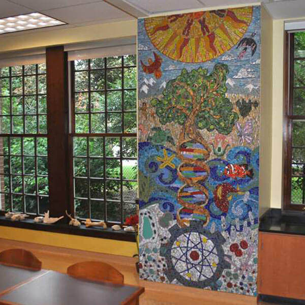
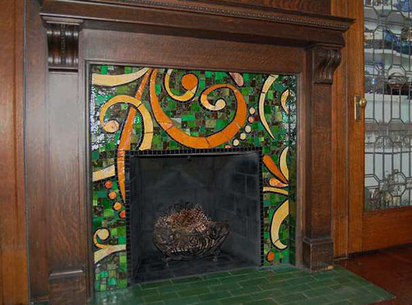
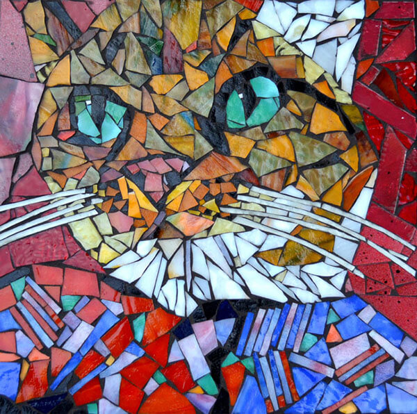
Stevo’s style is a combination of realistic or iconic figures in compositions that have some understated elements of whimsy or abstract pattern added.
I think this combination offers more for young minds to see and think about than straight realism or straight abstraction or straight whimsy.
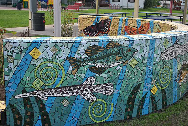
Reasonable “Pixel” Size
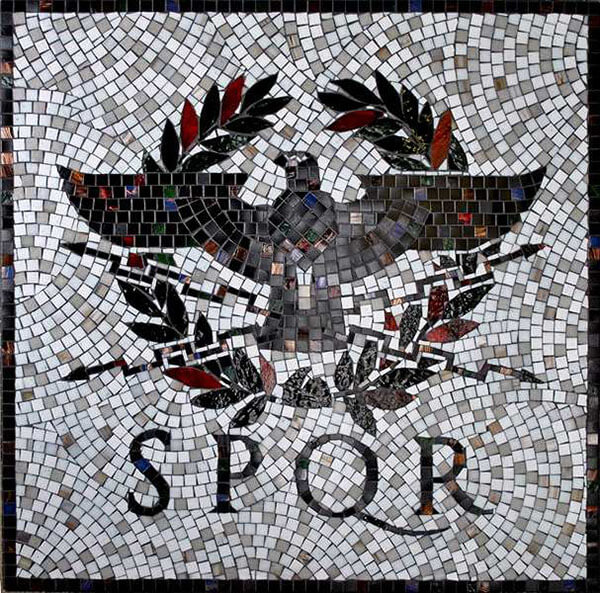
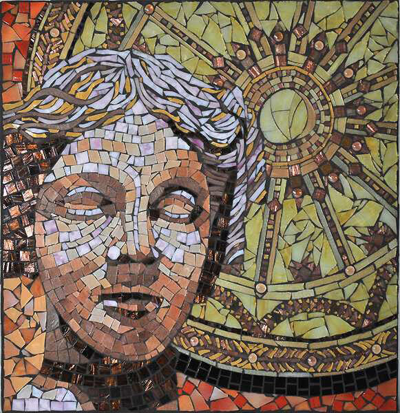
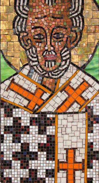
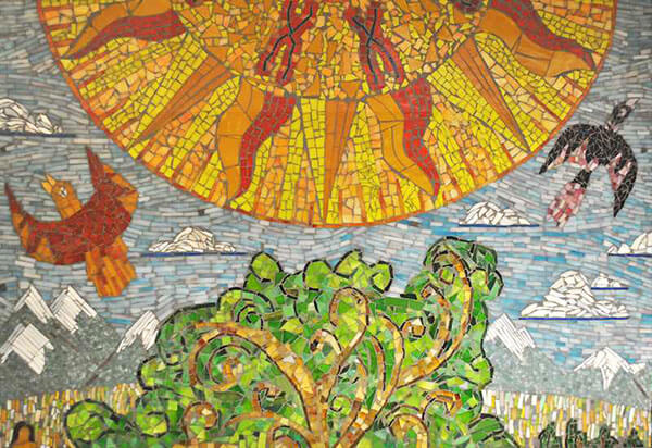
The details in Stevo’s mosaics are usually rendered with tile pieces in sizes that are easiest to use: not so small that many rows are needed, but not so large that pieces have to be cut to width. Stevo “makes it look easy.”
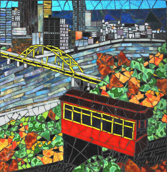
Mixed Andamento
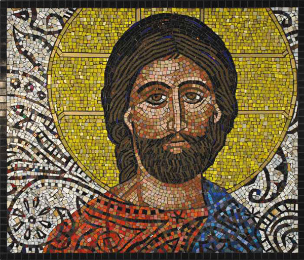
Stevo combines different styles of andamento in the same mosaic. Some details are rendered with natural shard shapes (irregular triangles and polygons) that are nested naturally (instead of arranged in rows). Other details are rendered using rectangular tiles in rows or curving work lines. Still other details are rendered with pieces cut to size and shape in a “stained glass” style where each color field is a single piece, or two or three pieces at most.
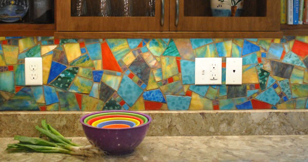
Great Use of Color
Stevo makes great use of color to create appealing images and abstract elements.

Leave a Reply