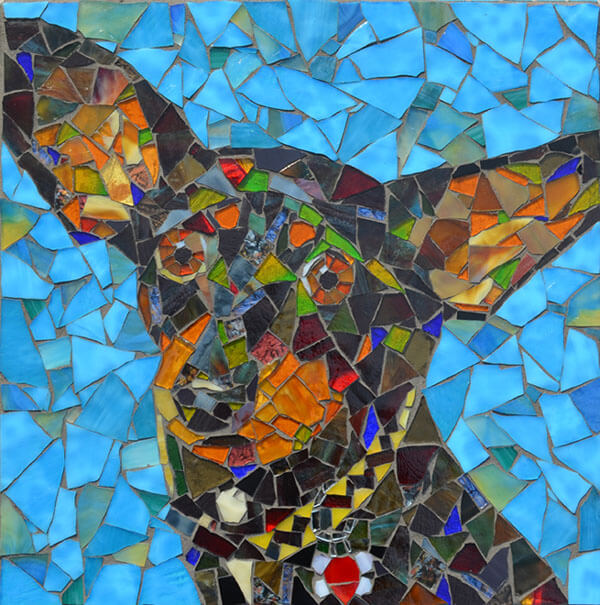
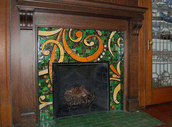
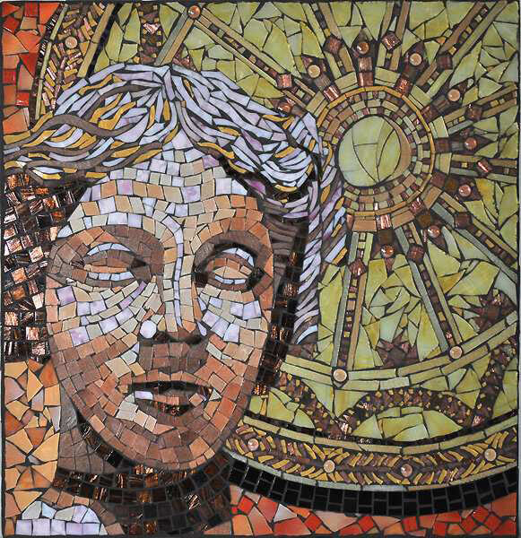
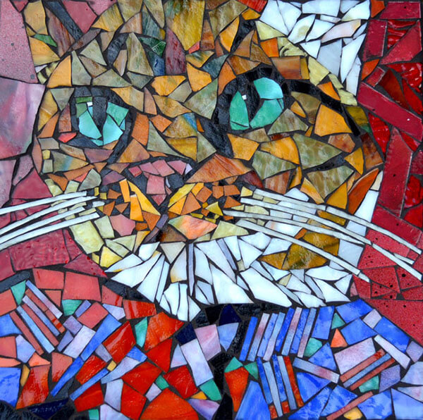
Artist Steven “Stevo” Sadvary has a broad mosaic portfolio of pet portraits, cityscapes, signage, educational murals and other public art, all solidly rendered.
I like public art that inspires people to make their own art, especially children, and I think there are a few things about Stevo’s art that make it optimal in that way.

“Figurative Plus”
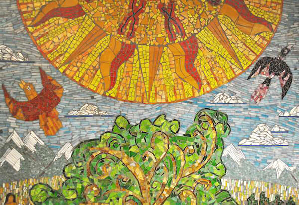
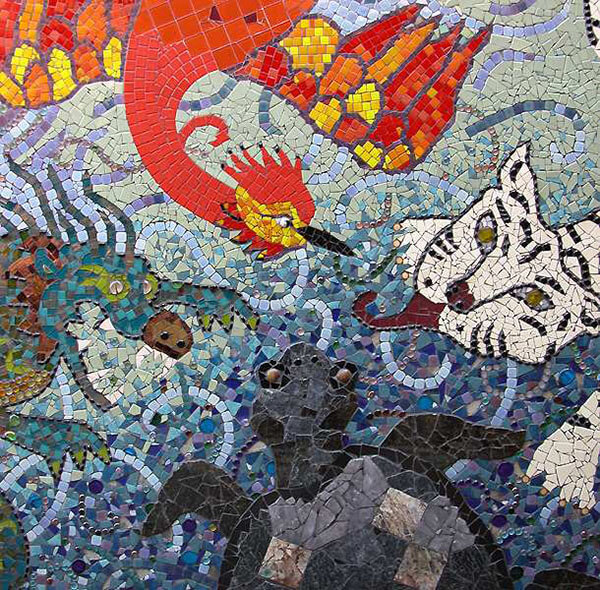
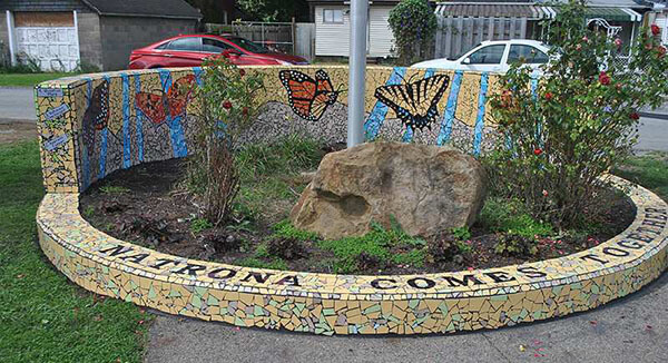
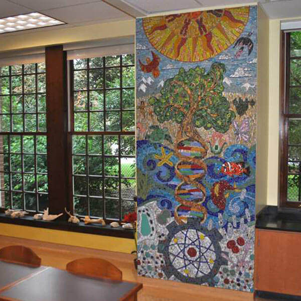
Stevo’s style is a combination of realistic or iconic figures in compositions that have some understated elements of whimsy or abstract pattern added.
I think this combination offers more for young minds to see and think about than straight realism or straight abstraction or straight whimsy.

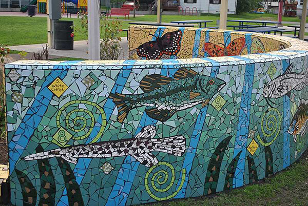
Reasonable “Pixel” Size
The details in Stevo’s mosaics are usually rendered with tile pieces in sizes that are easiest to use: not so small that many rows are needed, but not so large that pieces have to be cut to width. Stevo “makes it look easy.”
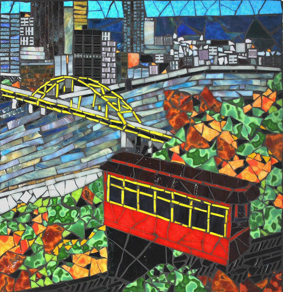
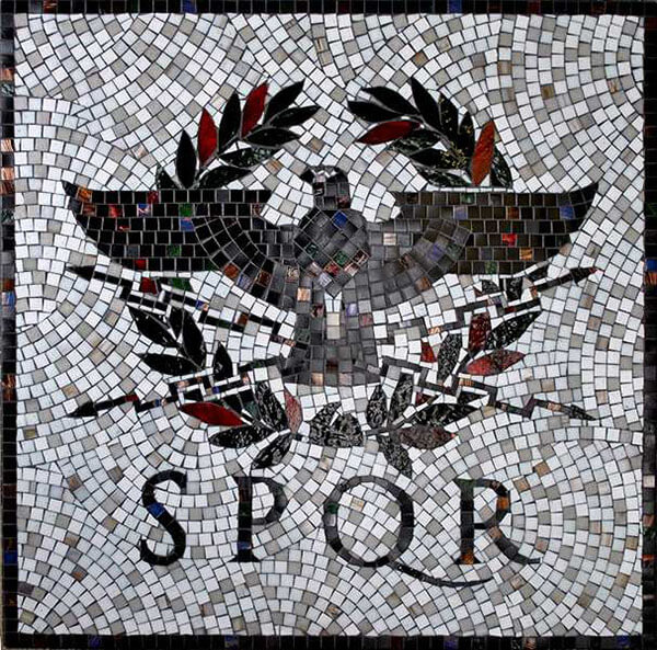
Mixed Andamento
Stevo combines different styles of andamento in the same mosaic. Some details are rendered with natural shard shapes (irregular triangles and polygons) that are nested naturally (instead of arranged in rows). Other details are rendered using rectangular tiles in rows or curving work lines. Still other details are rendered with pieces cut to size and shape in a “stained glass” style where each color field is a single piece, or two or three pieces at most.
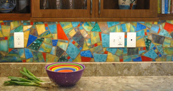
Great Use of Color
Stevo makes great use of color to create appealing images and abstract elements.


Thank you for this publication. Really enjoyed having a glimpse of ‘Stevo’ Sadvary’s work.
Stevo Sadvery was my mosaic mentor and is an amazing artist. He can cover an entire panel with mastic and just remember where everything is supposed to go; his work ethic and ability to work quickly is impressive, and his studio is full of wonderful creations. He’s also a marvelous fabric artist, and can work a loom like nobody’s business!
He eats right, cares for older shelter dogs, and donates his time to community projects… If you’re lucky enough in person to absorb a bit of his lifestyle habits into your own life, you will be forever inspired.
How inspiring! Yes- he does a masterful job of combining different tessera and both representational and more abstract images. The results are both playful land sophisticated.
I also like the black grout used with tight spacing between the tiles and pieces. I have had a problem with thinking black grout can be too heavy-handed and have been experimenting and sometimes struggling with grout colors. I see in his work how black can be distinctive, yet not overbearing when the lines of grout are narrow and even somewhat irregular.
Great post and do keep ‘um coming.
i would like more info on supplies , tools, etc. I have been involved in tile installation for over 50 years and hold a minor in art, so technique would be helpful but not a necessity. I like what I see on your web site.
Hi Richard,
For economic and environmental reasons, we avoid printed materials and use the website and blog as our definitive reference and catalog. You can read complete product descriptions by clicking an individual color thumbnail and scrolling down. We can also answer questions in detail via email.
Thanks!
Joe