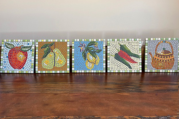
Louise Roberts recently emailed me to say that she has been teaching herself mosaic using our blog and that she followed my recommendation to make a series of small mosaics of the same size.
She also attached some photos of her mosaics, and they are impressive. To me, her mosaics are yet more proof that a series of small works is the most efficient way to learn.
This is particularly true in the mosaic medium. In mosaic, there is a learning curve for each size or resolution, especially if you are just getting started in the medium.
In Praise of Series
When you work at the same size and resolution for a series of mosaics, you become faster and more efficient because you are cutting and handling pieces of the same size range and using them to render the smallest details in the same way.
When you change size and resolution for each mosaic, the opposite is true and you have to get accustomed to cutting pieces of a different range of sizes and to the how those pieces are used to render the smallest details.
It’s almost like you have to unlearn what you learned for the previous mosaic, at least in terms of how the smallest details are rendered.
Concept
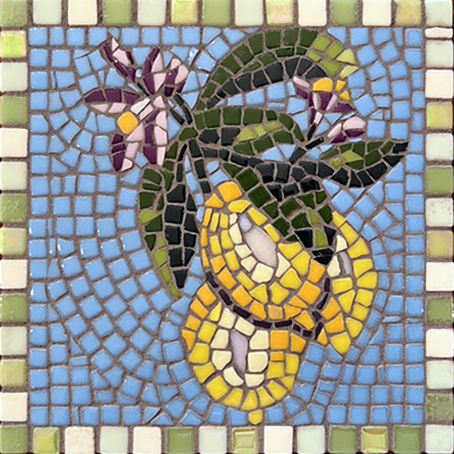
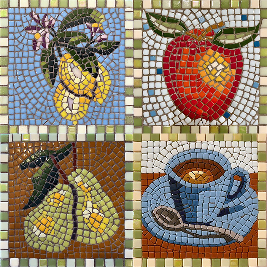
The theme of Louise’s series is traditional still life models such as fruit and dinnerware, each rendered as individual icons.
The chunkiness of the tesserae contrasted with the attention to highlight and shadow is what makes them genius to me.
A sense of light is created by the artist’s attention to value contrast and not in their ability to cut and fit tiny slivers with modern precision.
I think that is why they remind me so much of ancient Roman mosaics.
Louise also uses classic andamento of mixed types, and this only reinforces the classic Roman association.
The variegated borders Louise used have a more modern look.
Highlight and Shadow
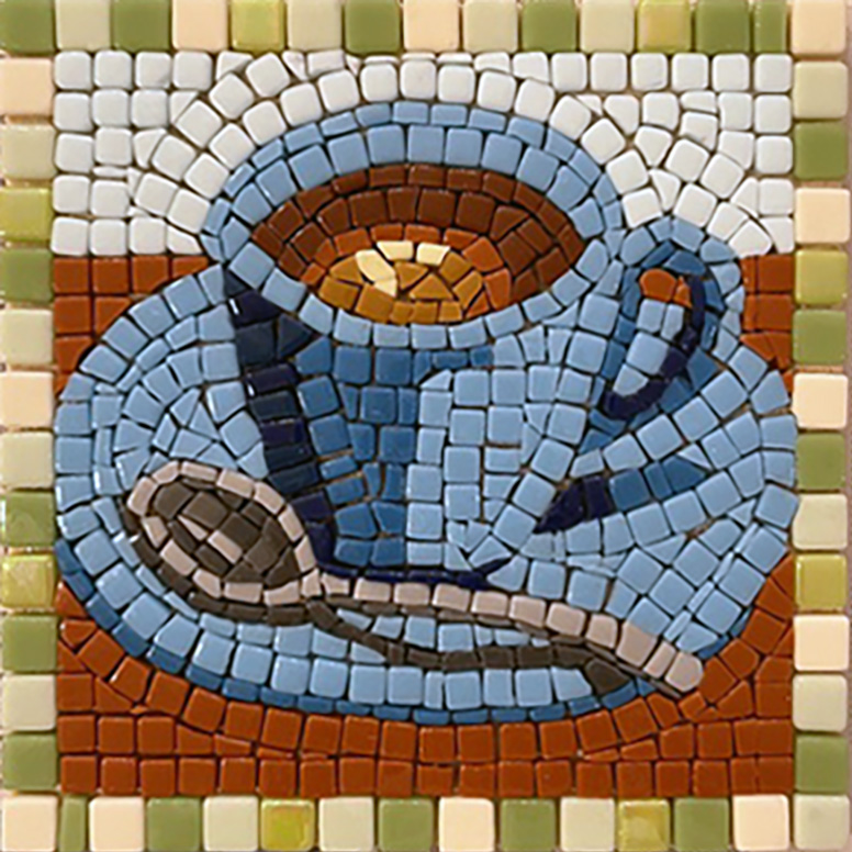
Louise’s series is a tour de force of highlight and shadow tightly executed in a limited color palette with mostly uncut tiles.
The chunkiness of the whole molded tiles and limited number of colors creates a more posterized image than the image that could be made with stained glass and its infinite palette of hues and tints and shades.
Those limitations only serve to make Louise’s use of value contrast look more inspired.
There is highlight and shadow that create a sense of light, especially when the mosaics are viewed at a proper distance:

Notice how chunky the mosaic apple looks when viewed at close range:
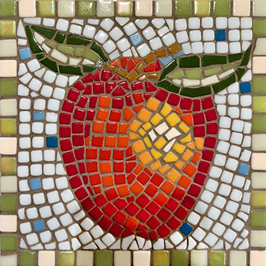
Compare the close up of mosaic apple to how sophisticated it looks in the group photo.
That is why you need to step back and squint or look at a thumbnail photo of the mosaic as you work on it to truly see it.
It’s the same way with painting.

Leave a Reply