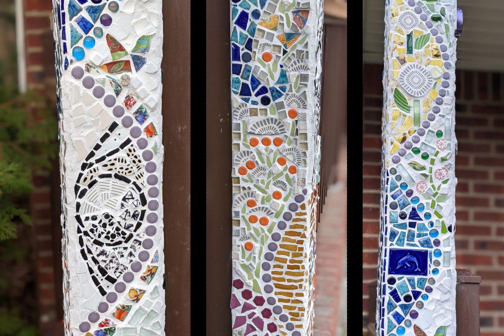
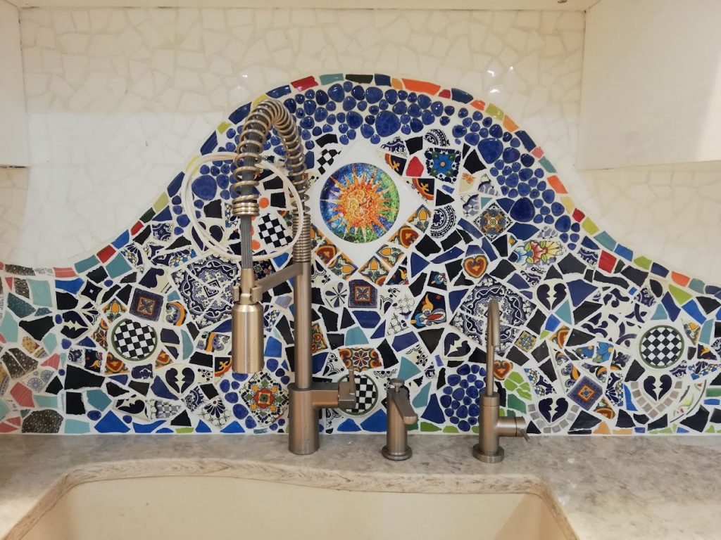
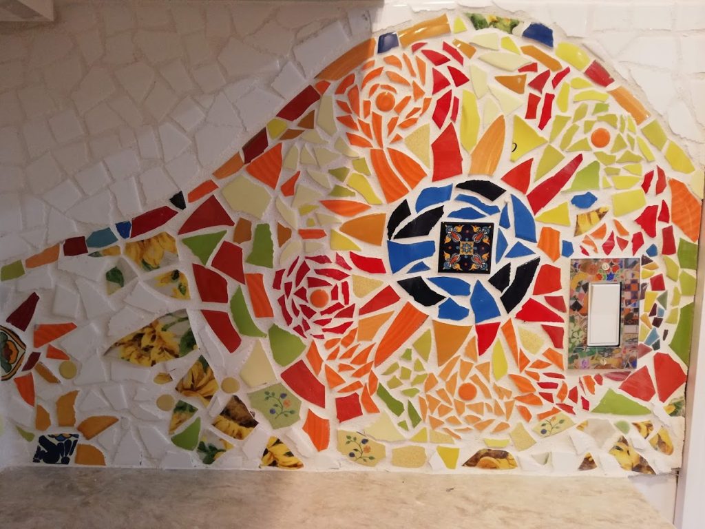
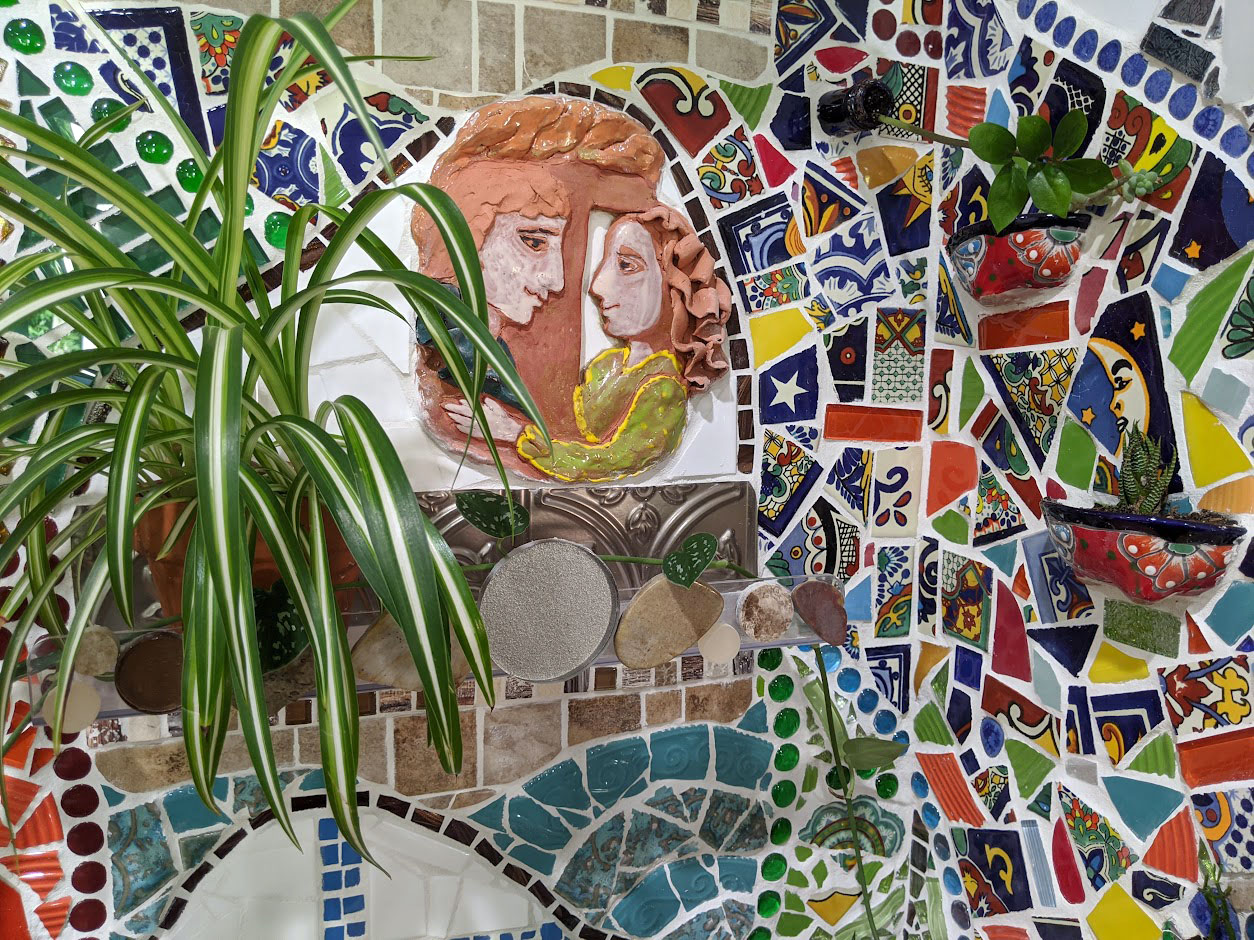
Artist Masha Leder‘s mixed pique-assiette architectural mosaics using white grout are so good I wanted to name this blog article “In Praise of White Grout.”
I have been hoping more people would email me some photos of their white-grout mosaic artwork ever since I started posting about avoiding white grout in mosaic images, meaning figurative mosaic that strives to be as life-like as possible.
Well, art doesn’t have to reflect nature or nature alone.
This is particularly true of mosaic, which intrinsically incorporates the concept of found object (anything can be a tile) and intrinsically suggests the possibilities of abstract geometric art (when uniform tiles are used).
The aesthetic of bold-colored block prints on white fabric is as old as the bleaching of cloth, and this ancient aesthetic has influenced other mediums, particularly ceramics and dinnerware.
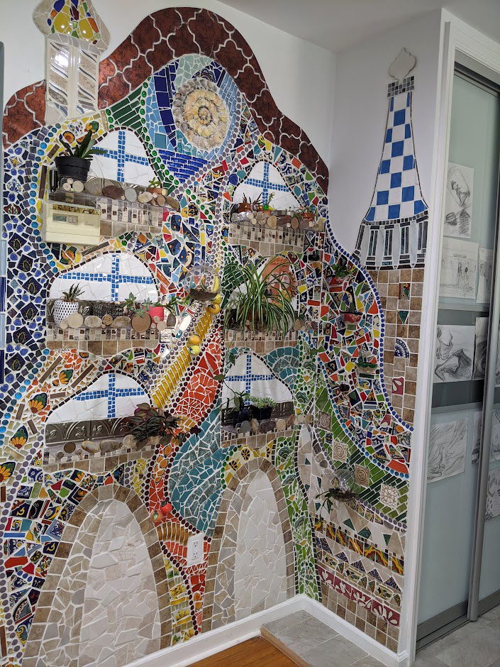
I think that is why pique assiette so often uses white grout, and why people like the look and feel of it, expect it, even when the mosaic in question is a small piece of furniture that doesn’t have to conform to architectural expectations.
When the mosaic is a large architectural surface, the brightness of white grout is desired if not required.
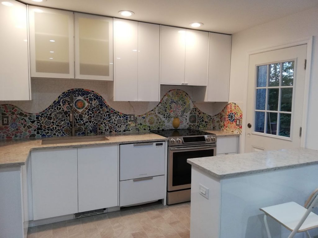
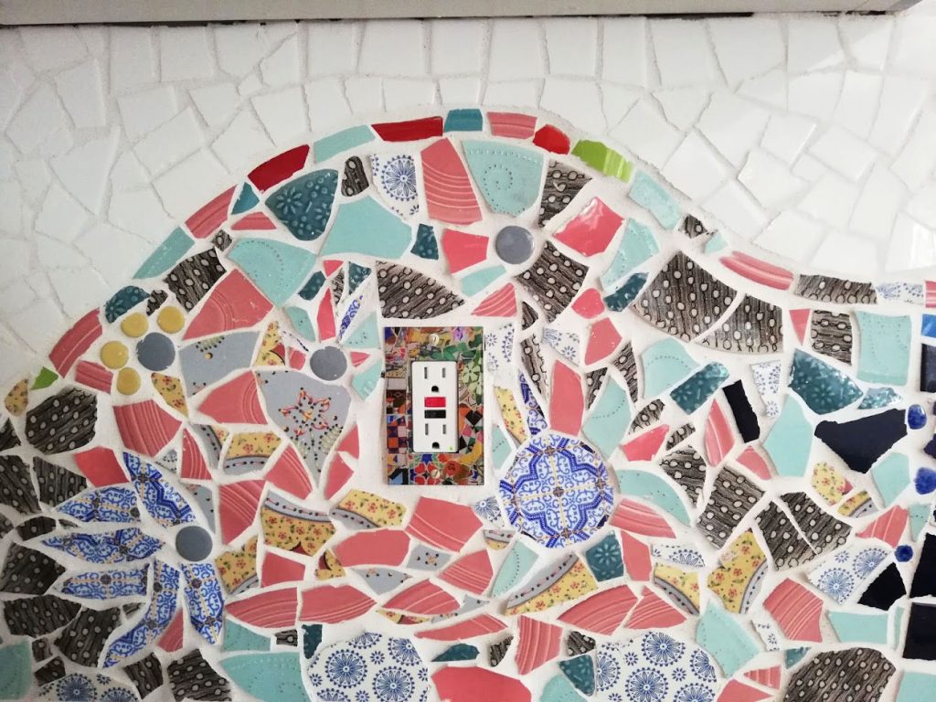
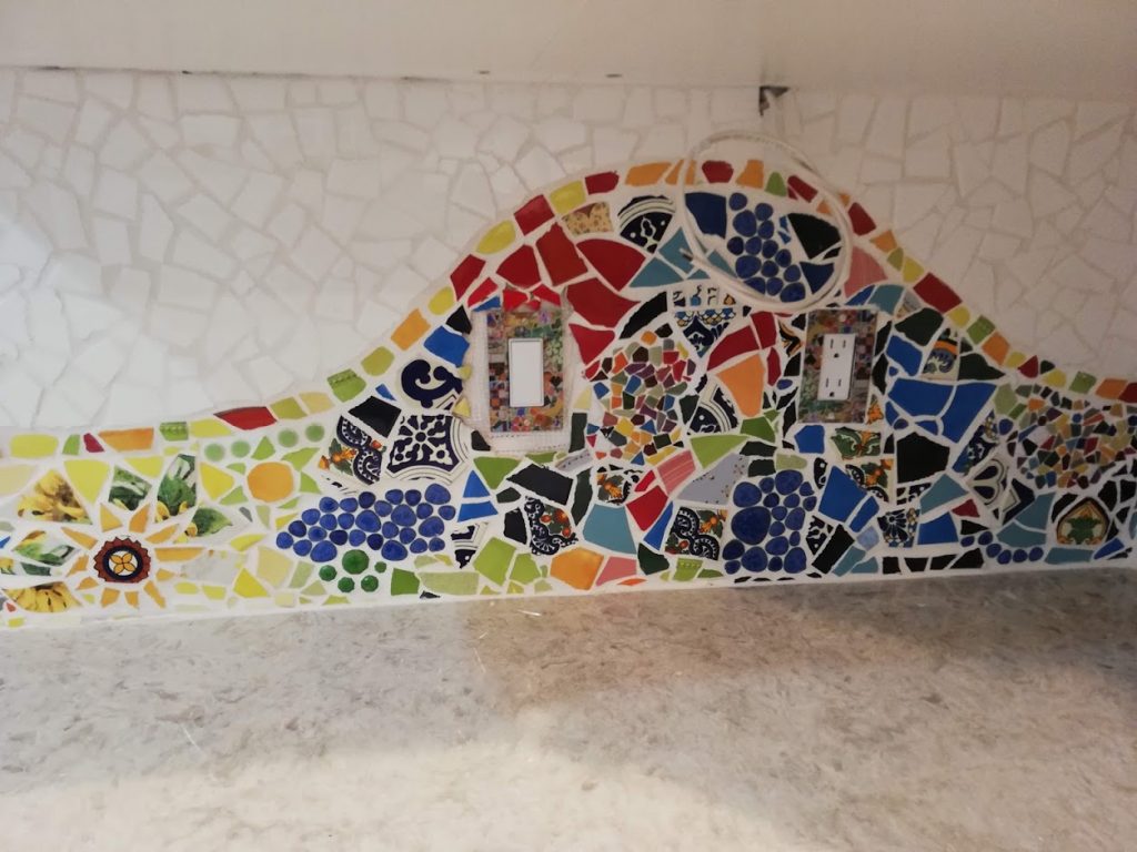
Notice how the backsplash underneath the cabinets is in a shaded location and how the white grout keeps the mosaic from looking like a solid dark element in an otherwise light/white room.
In this case, the grout ties the color scheme of the mosaic to that of the room.
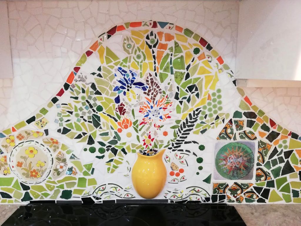
The White Marble Aesthetic
If you are thinking of a stone column, then you are probably thinking of a white marble column.
If you are thinking of mixed-media or found-object mosaic, then you are probably thinking of a surface that looks like pieces pressed into concrete with a wider-than-normal gap between pieces.
I have also heard multiple people describe this sort of pique-assiette/found-object work as looking like candies pressed into white frosting.
There are many “background associations” that make us think of using white grout in these mosaics.
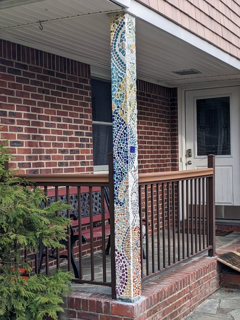
Materials and Methods
Masha says that making the columns was difficult and tedious because it was executed piece-wise on a vertical surface.
If you prefer working piece-wise on a surface instead of laying up your mosaic on mosaic mounting tape, then one option would be to make the mosaic on sections of concrete backer board, which would then be mounted to the column.
One down side to that approach would be the corners, which would require special attention to avoid leaving a gap there that was larger than the grout gap used elsewhere in the mosaic.
A Millefiori Aesthetic
When I look at Masha’s happy mosaics, I think about the portraits and interiors Matisse painted, and how much of his subjects included printed patterns and fabrics.
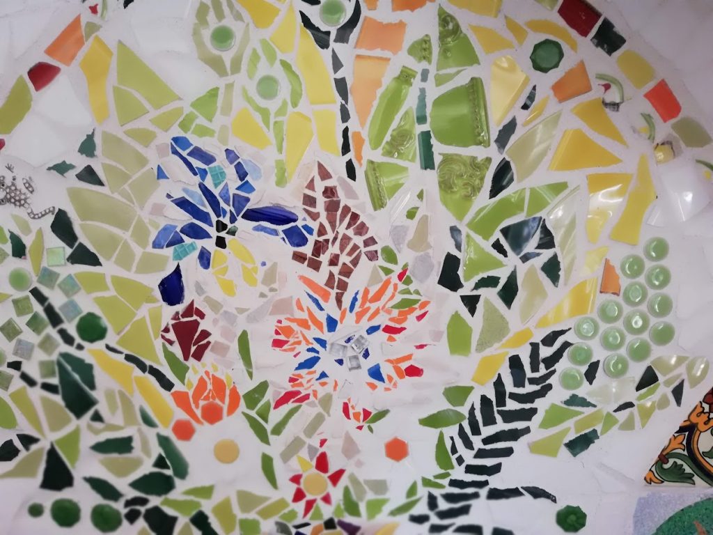
There is an exuberance of color and an “eye-candy” aesthetic, like a thousand flowers.
Interiors should be bright and happy places, and Masha’s mosaics are spot on.

Leave a Reply