Recently artist Jill Miller emailed me wanting some advice about choosing colors for a mosaic table top she was making, and the design she was a chickadee bird with holly leaves and berries. From her photos and a description of the colors she wanted to use for the border of the round table top, it was obvious that she wanted to use muted colors instead of intense colors. I was happy to help. I thought her project was a great example for how to choose colors for backgrounds and making sure there was adequate contrast between the different elements.
Whether muted colors or intense colors are used, it is still important for there to be contrast in the colors that define different elements, else the elements don’t stand out from one another.
TIP: You don’t have to glue tiles down to see if they are the right color. You don’t even have to position them carefully. Just spread them roughly where they should go, take a break, and then look at the mosaic later. The loose tiles will either contrast the image enough to make the figure stand out, or they won’t. Your fresh unbiased eyes won’t lie to you. Don’t try to rationalize a color that doesn’t work based on some design you have in mind. Listen to your art. Look at it and really see it.
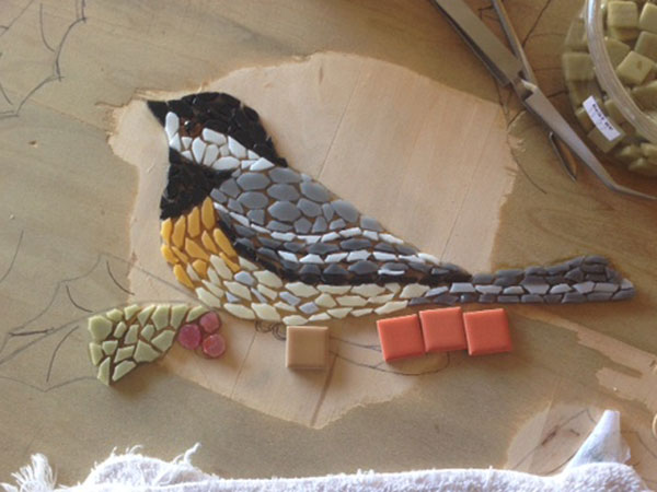
Color Study Version 1
Each work of art is just one version of many potential variations that could have been made with the same design. While it is not critical that you stay true to your original vision, it is important that you don’t have competing versions trying to exist in the same composition. The most important thing to stay true to is the design that is taking shape and making sure that color choices are internally consistent.
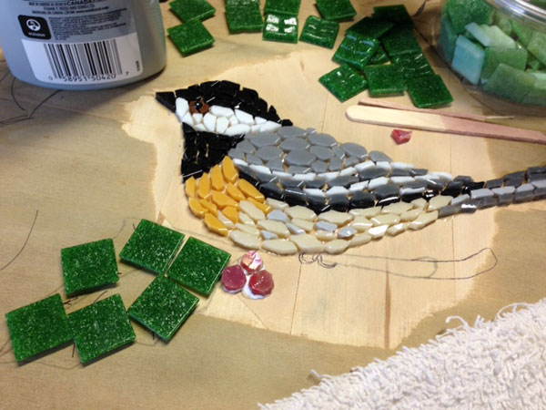
Color Study Version 2
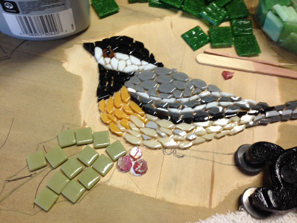
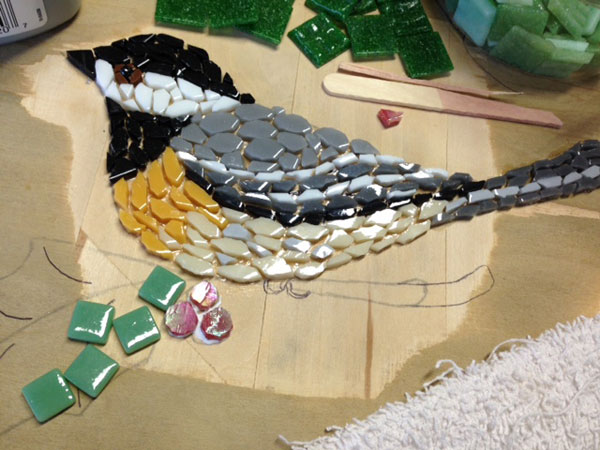
Color Study Version 3
Wrong Color? All Is Not Lost.
Most beginners are so eager to begin work that they start gluing down tiles before they are sure they have the right color. Usually they don’t notice that they don’t really like the color until they have spent an hour or so mounting tiles in glue. If that happens, all is not lost. Put on some work gloves and safety glasses and scrape up the tiles with a screw driver. Soak them in water to remove glue residue. If the glue has already hardened for several days, you may break some tiles while scraping them up. If so, use a vacuum to pick up sharp slivers. Moistening the tiles for 30 minutes with a cotton swab dipped in water can help soften glue, but it can also increase the risk of creating gouges and delaminations in plywood backers.
Color Wheels and Complementary (Contrasting) Colors
Color wheels are an artist’s tool for choosing complimentary colors, which are pairs of color “opposites” that provide maximum contrast to each other: red and green, orange and blue, yellow and purple. Those are the main pairs of opposites, but the hues in between also have opposites. For example: blue-green and red-orange. Color wheel charts position all of these opposites directly across the wheel from each other, which makes it easy to see what the optimal contrast would be for any given hue.
You can see some color wheels by searching Google for “color wheel” or “complimentary colors.” Some are more in depth than others. I like the ones that also show different options for value, which is the relative lightness or darkness of the color.
Intense Colors and Contrast
Contrasting colors are important because they make images stand out. Look at these great bird mosaics made by Phil Lamie’s elementary school students, Notice how these mosaic take full advantage of contrast between intense blues and warm oranges. Notice how the cool blues are usually in the background and the warm colors are in the figures in the foreground. In the case of the blue bird, notice how the blue in the bird in the foreground is more intense than the blue of the sky in the background. Value and intensity can be used to make foreground images stand out from backgrounds, as the blue bird mosaic demonstrates. All of these bird mosaics are visually striking because they follow basic rules of using color.
Leave a Reply