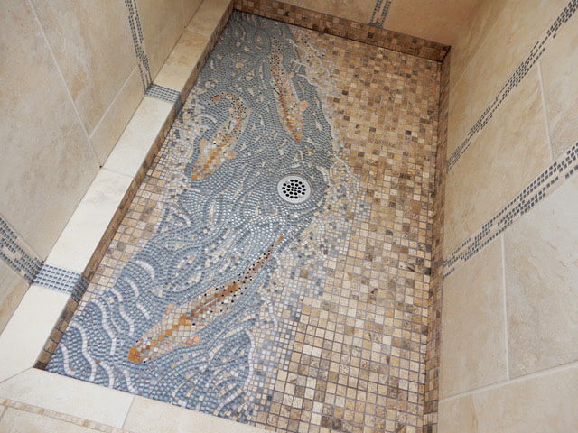
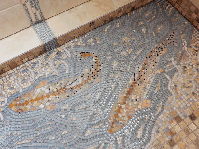
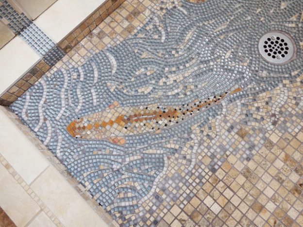
Artist Jen Vollmer recently completed a shower mosaic which features fish and flowing water executed in the same colors as the surrounding mosaic tiling. Jen says that in retrospect, she wishes she would have used a darker grey grout and blue/green glass tiles instead of the light blue, which would have increased the contrast.
I’m partial to intense colors and strong contrast, and those are required for an image to be eye-catching, but what struck me about Jen’s mosaic was that it is subtle in a professional way, integrated with the existing tile work and intentionally calculated to not stand out too strongly.
It was almost as if a client had commissioned the work and said, “Make the design figurative and naturalistic and have its own flowing andamento, but make it also integrate visually with the grids of tile that it runs through, and do that as seamlessly as possible.”

Technical Issue: Tile Thickness
The glass tile Jen used for the fish and water has a thickness of 4mm (~1/8 inch), but the stone tile work of the shower has a thickness of 10mm (~3/8 inch). This problem was overcome by picking up the design with mosaic mounting tape, and then pressing the tiles into a bed of thinset mortar. I wrote a blog article about how to lay out your tiles on a pattern and then pick it up with tape.


Leave a Reply