The mosaics in this article are mostly student work and use a wider grout gap than I recommend. The most-helpful tip about grout color is to use smaller grout gaps:
The smaller the grout gap, the less impact grout has on the image and its colors. The process of grouting is also easier with a smaller gap.
All that being said, some artists like wide grout gaps because they give the mosaic the look and feel of tiles pressed into wet mortar. That’s fine. It all depends on what you are trying to do.
Most of the improvised tile/found-object mosaics of Mexico have that look and feel because that is what they are, and they are nothing short of magical.
These mosaics are from one of Jill Gatwood’s many classes. As a group, these mosaics illustrate several discussion points about grout color.
Loss of “Mosaic Effect”
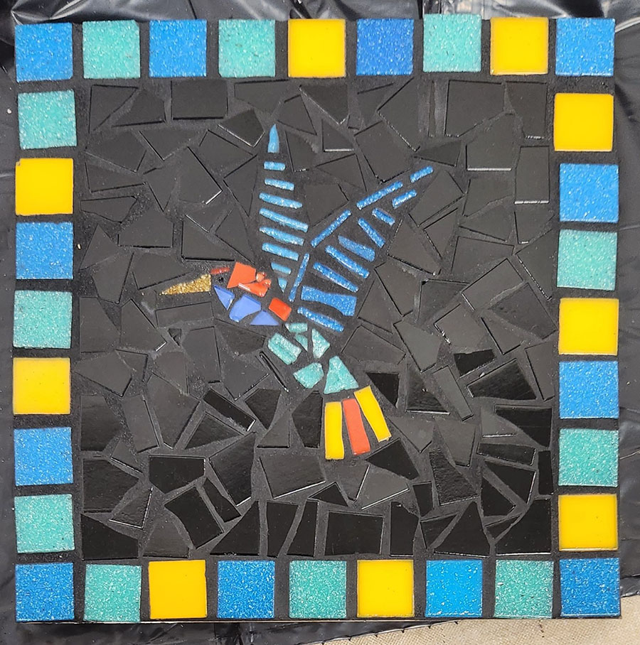
The first of these points is the loss of the “mosaic effect” when grout color matches the color of a group of tiles and individual tiles are less visually distinct.
See the hummingbird mosaic #2 for an example that looks fine in spite of the issue.
Notice how the mosaic effect isn’t totally lost in #2 because the gloss of the glass contrasts the matte finish of the grout, which isn’t quite as black as the tile.
If you wanted to avoid the matching look in #2, you could variegate the field of black tile by mixing in some related color, say a very dark gray or midnight blue.
The issue in #2 isn’t necessarily a negative result to be avoided.
I could see many projects where I would want to a background that was “visually simplified” with matching grout, especially if my figures were very filigree or “busy” like spindly tree branches in winter, and only a little bit of background was visible intermittently.
There are other situations where tile color matching grout color can be a critical problem, such as when an element in the image is narrow.
Narrow Elements
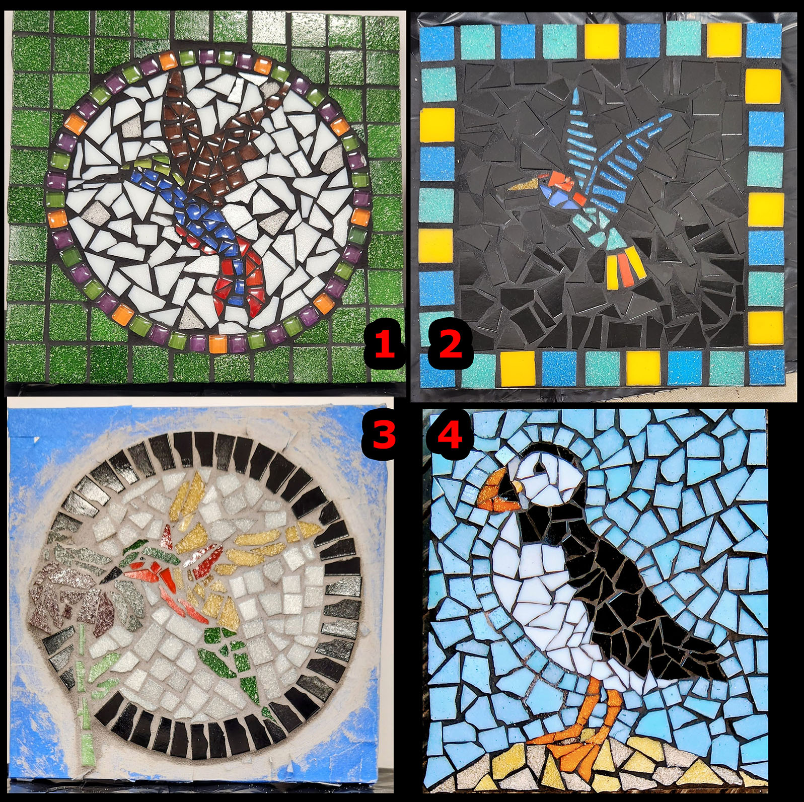
The hummingbird mosaic #1 illustrates the problem when an element such as a beak is so narrow that it is the same width as the grout gap.
Here it does matter VERY much that the beak matches the black grout line, or at least fails to contrast it sufficiently.
They are the same width, and so the beak isn’t readily distinguishable from the grout line.
Here the solution would be to use a different color tile for the beak, say the orange used in the border.
OR, to fix the problem afterward, the beak tile could be painted.
Remember, in art it is legal to cheat on stuff like that.
TIP: The tile for extremely narrow elements should never be the same color as the grout.
Painted into a Corner?
When we start with a blank canvas, there are infinite possibilities, but as soon as we add the first color, there are constraints on what other colors can be used.
That is why painters stress that a new color should be added only after careful consideration and that color schemes should be worked out before you start rendering.
Most of my successful mosaics have one thing in common: I worked out the color scheme beforehand. Or most of it.
I do this by laying out one tile each of the different colors side by side before I start rendering in any way.
However, sometimes I find that I have to lay the tile on the pattern to see how the color scheme works in different parts of the design, especially small problematic details.
In this case, I do cut some of the tile and position it, which is fine, but glue is NOT involved at this point.
I encourage artists to play with tile on their patterns like this before they even open the glue.
Better still, work on a temporary surface so you can make edits before the glue.
Process of Elimination
Selecting a grout color is a process of elimination based on the tile colors used.
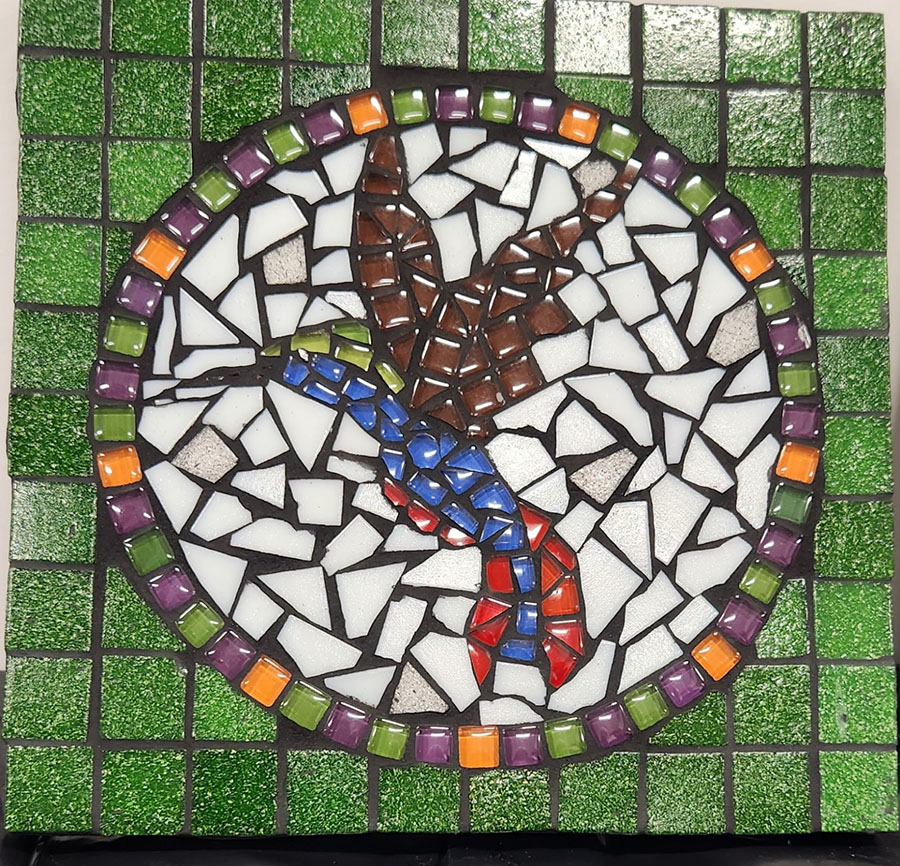
Consider the mosaic hummingbird #3 above. Once the artist decided the narrow beak should be black, it eliminated black as a choice of grout color.
The good news is that there is an easy workaround for this situation if the artist is set on using black grout:
When black grout can’t be used, consider something near black, maybe an espresso or mahogany or whatever. Most building material stores carry about 20 to 30 colors.
The grout color that was actually used seems too light and saps too much of the overall color intensity of the composition.
Fortunately, you can always stain the grout of indoor mosaic plaques using artists acrylic paint if you need to darken grout that turned out too light.
Cutting Tile
Note that the keystone cuts of the black border in hummingbird #3 were made with two cuts instead of one.
My recommended method of cutting a square tile into keystone shapes is to cut the square tile in half with one cut at an angle.
A certain level of variation in the keystones can be tolerated and nested to form fairly uniform arches or circular borders such as in hummingbird #3.
For rendering figures, this natural variation in the cutting angle and width of “keystones” is a good thing and makes tile fitting easier.
As a rule, avoid trimming tiles with multiple cuts. Instead, cut several tiles once and select the best piece you cut. Use the rejected pieces elsewhere or in a second mosaic.

Optional vs. Critical Details
I love the giraffe in the mosaic above. It is loosely executed with a novice hand, and yet it captures the likeness of giraffe exactly. How is that possible?
A huge part of it is the shape and placement of the eyes, and the rest is the correct shape and placement of the ears and other facial features.
If you get the critical details right, the rest is optional.
Well, maybe not completely optional, but there is a lot more latitude. The focus of the viewer will be on the critical details that capture likeness.
Before I draw a pattern for a mosaic, I don’t just look at one model, at least not initially. First I look at many different online photos of whatever it is and make a short mental list of the critical features.
The giraffe’s beautiful long lashes and the wide spacing of the eyes would have topped my list.
Rendering these lashed eyes with a single piece or two of glass is brilliant.
Notice that the pieces are irregular angles and there is no symmetry between right and left, and yet they strongly resemble the features intended.
There is no workmanly focus on irrelevant details. There is only an artistic seeing of the lashed eyes in the image(s) and what is important about them as shapes: They are flat black triangles that taper to the outside.
I think the grout could benefit from staining, but I wouldn’t go too dark, and certainly not black.
The black tile features are the focus and definition of the image being suggested, and these need to remain in high contrast with the rest of the mosaic.
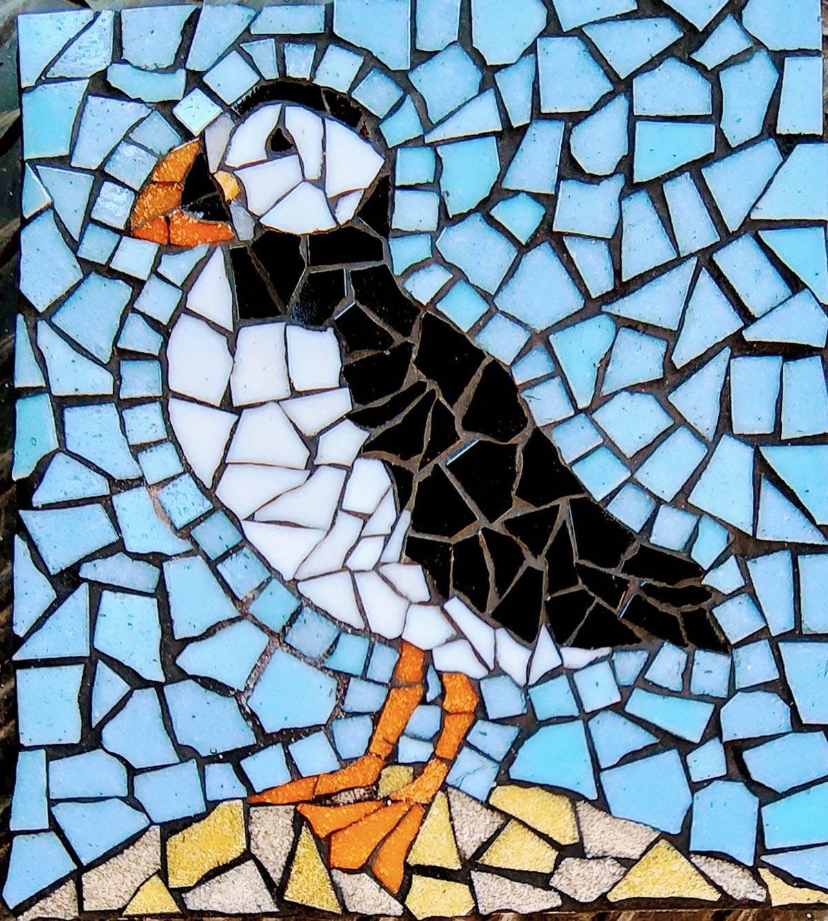
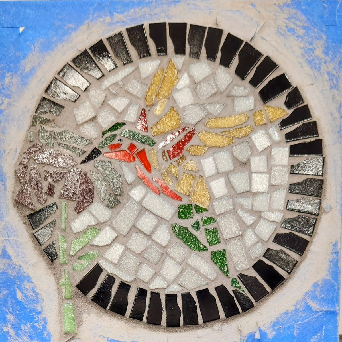
Jill’s Puffin
Jill made a mosaic puffin during this particular class, and it turned out very well.
Here she points out some of the technical reasons why the mosaic works in spite of having black grout and black tile in the figure:
“I made sure the background tiles fit closely up to the black back of the puffin so the form would be preserved.
“The white tiles fit close to the black, triangular eye, to keep the shape.
“I also left a slightly wider grout line against the white belly, to create a dark line of grout, to be sure the white didn’t disappear in the light blue.”
-Jill Gatwood
Artists are always practicing even when not in the studio. We practice by seeing. We study images.
Notice how much of capturing the essence of puffin comes down to the eye, head, and beak.
I like how the foot is rendered with three pieces of glass instead being mechanically built from pieces representing toes and webbing. This simple construction keeps the foot from being overly complex compared to the rest of the mosaic.
If an element is highly detailed, then it becomes a focal point. Keeping similar levels of detail for different areas in a composition is important for balance.
Abstract Art
Rendering an image with some level of verisimilitude is a task unto itself, actually a whole set of tasks.
Learning to mosaic has its own learning curve.
I think some novices complicate the process by trying to grasp both at once.
The beauty of glass tile mosaic art is that it naturally lends itself to abstract art.
You can start with a very simple pattern and quickly add a lot of visual interest and complexity merely by variegating the color fields.
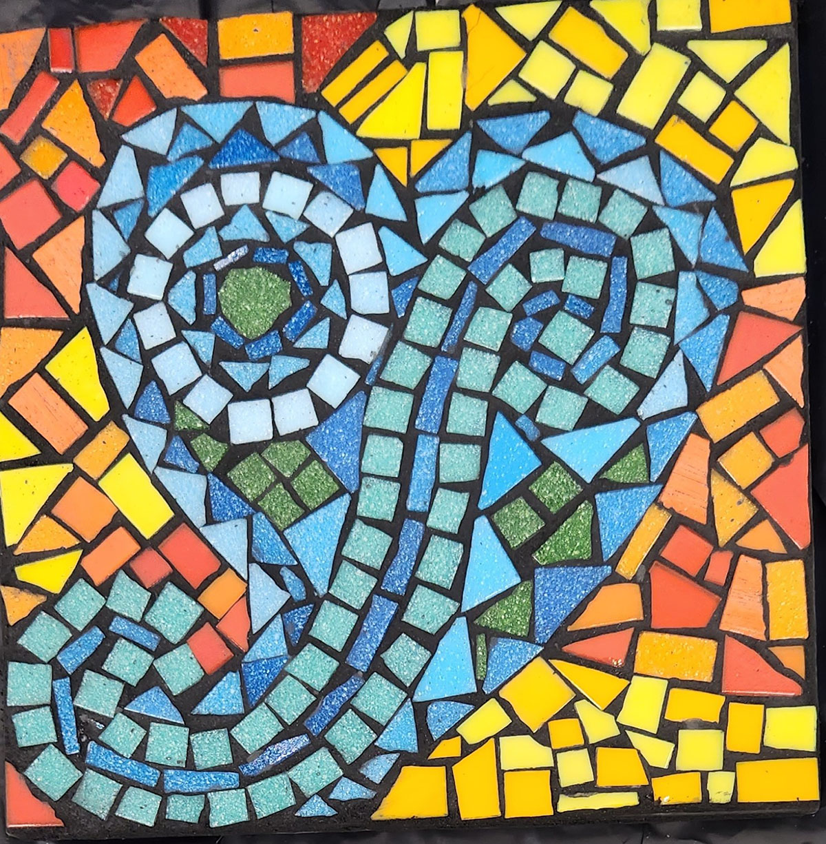
I love the Paisley Hear Mosaic above. There is flow and motion and a good contrast of hot and cool colors and value. The black grout makes the color pop.
If you are worried about your drawing ability for an upcoming mosaic class, consider simple abstract shapes of this nature and focus on learning tile and and mosaic process.
That way, you can play with color instead of stressing about the demands of rendering.
Leave a Reply