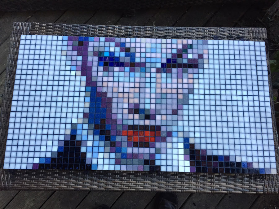
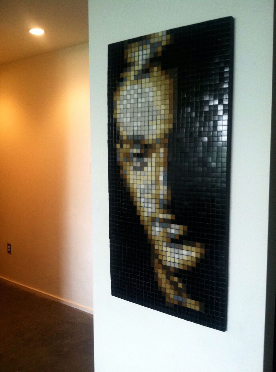
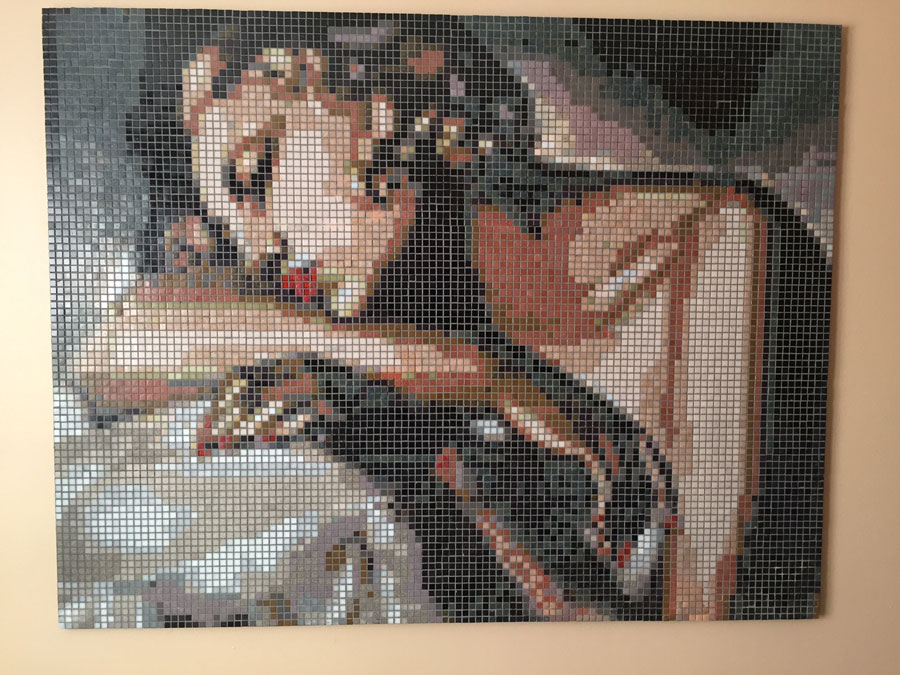
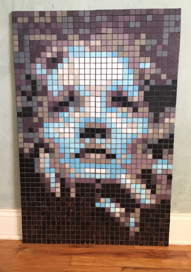
David Armstrong has created some inspiring mosaic portraits, and he did it using whole tiles arranged in a grid instead of irregular pieces cut and fit as needed. Normally, I dislike mosaic designs based on grids because they lack the extra visual element provided by tile arrangement (andamento), but David’s work has tons of visual interest that more than compensates for this.
The reason David’s work grabs me is easy to state: the artist used the right ratio of tile size to detail size, so that the coarse “pixels” cause the mind to mentally squint to see the image in an Impressionist sort of way. There are also great color choices and execution, but a gridded mosaic can have these and still be sterile. David’s mosaics are different.
The key step in making a grid mosaic image that has the type of visual interest that David gets from the tile itself is selecting an image and determining what size you should make the image to make its details chunky but discernible as a whole.
Practical Tip: Print out different sizes of the image you are using for a pattern and position tile on them to render a key area, such as an eye. Compare different sizes side by side. Don’t be afraid to spend a lot of time on this step. It is a big decision that determines the whole look and feel of the mosaic.

Of course, your model image also needs to have intrinsic visual interest and be executed in contrasting colors and all that, but the most important factor for visual interest as mosaic per se will be the relationship between the size of details and the size of tiles used to render them.
Ironically, most artists making naturalistic mosaics don’t think about this point at all, at least not beyond verifying that the tiles they will be using are smaller than the details they want to render.
Sure, that is the correct thing to do from a technical standpoint, but if the tiles are smaller than needed, the mosaic will look machine made, like a piece of printed fabric, like the mosaics produced on spec by factories. David does just the opposite. David’s mosaics are an exercise in how large a tile can be used and still suggest enough of the detail for the image to be discernible.

Of course, you can moderate this approach if you want to more exactly depict the details of a larger image, such as David does in his mosaic interpretation of Lempicka’s painting “The Sleeper.”


Leave a Reply